

RECLAIM & RENEW
A cleaning company whose whole business is making things new again. We built its mark from a single R, turned around a centre until it forms a triangle.
The brief
Reclaim & Renew Ltd. delivers cleaning services built on transformation and restoration. The brand had to look precise and dependable on a uniform, a bin and a truck, and still feel fresh.
The approach
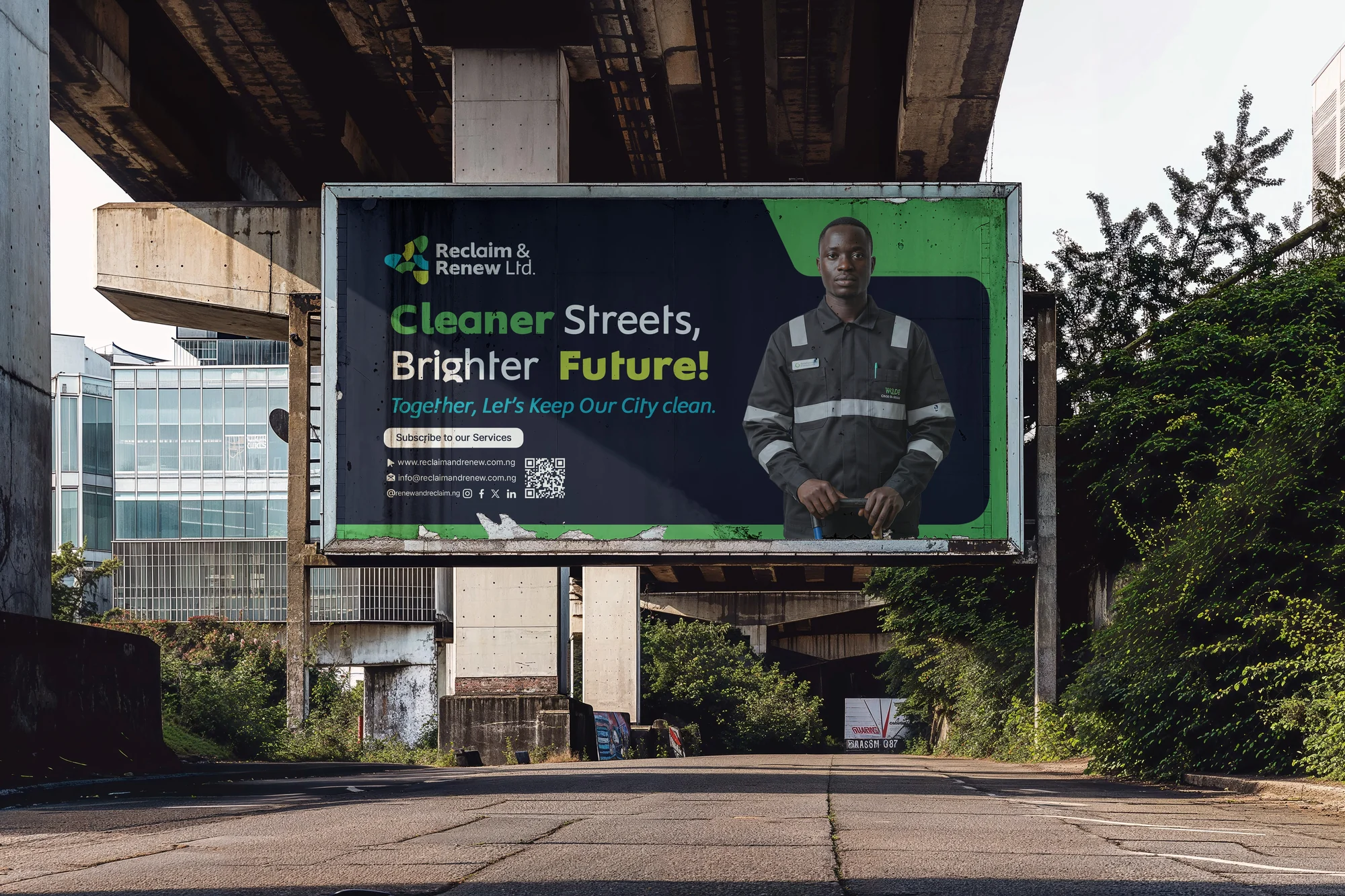
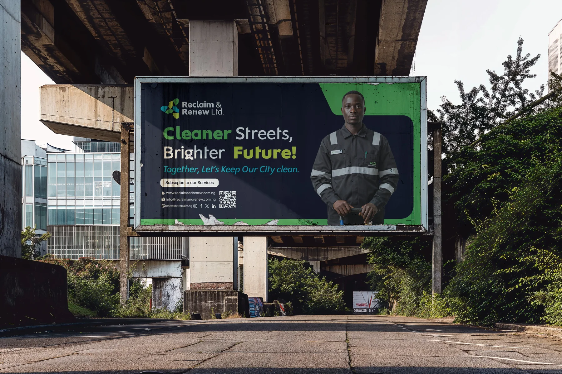
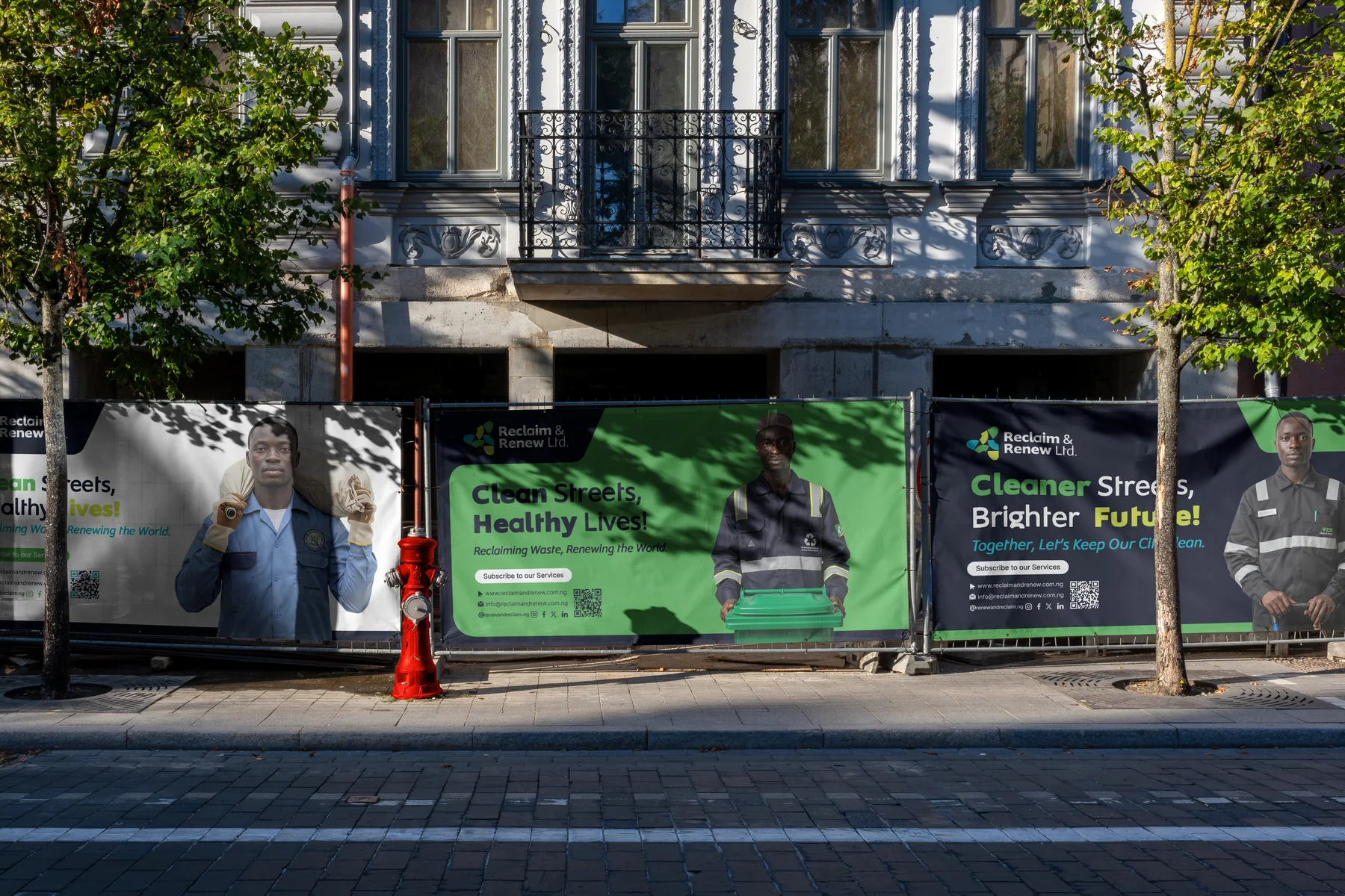
We drew a geometric initial R and repeated it in a radial pattern: renewal, continuity and balance. Together the three Rs form a triangle, for the stability and precision the job demands. Fresh green, lime and aqua keep it clean and bright; a deep navy anchors it. The same look carries the street campaign: Cleaner Streets, Brighter Future.
Scope
- 01LogomarkThree Rs in a radial repeat, forming a triangle.
- 02Logo systemHorizontal and vertical logos and circular emblems, on light and dark.
- 03Colour & typeFive colours and the Nanotech typeface.
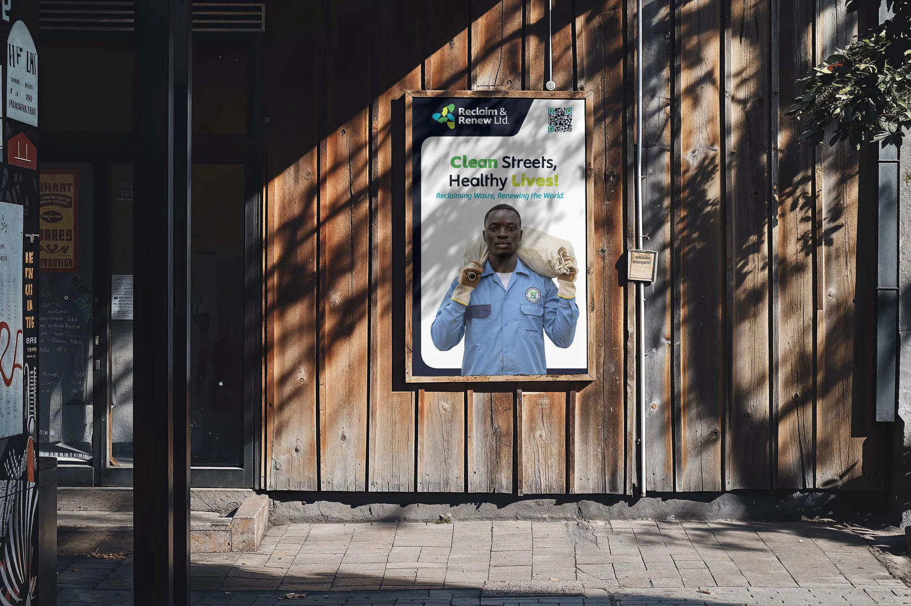
- 04CampaignCleaner Streets, Brighter Future: billboards, hoardings and posters.
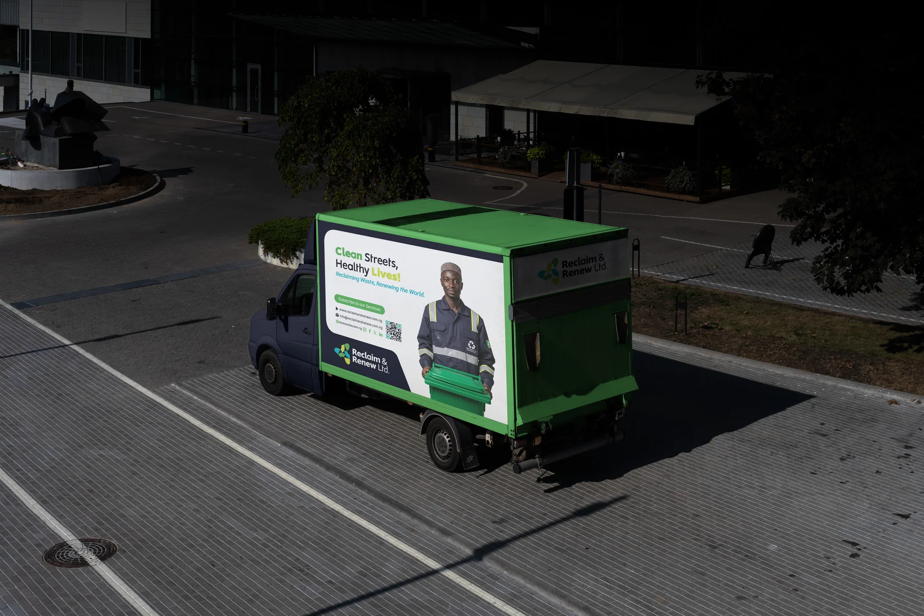
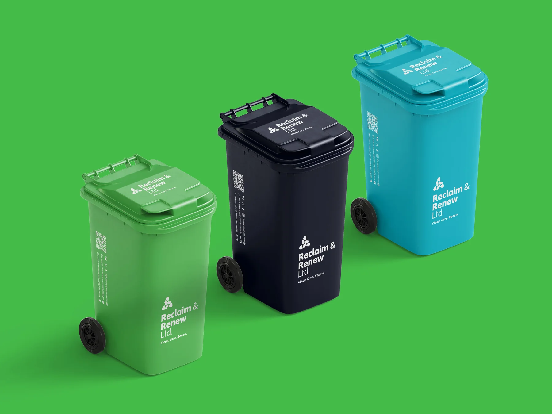
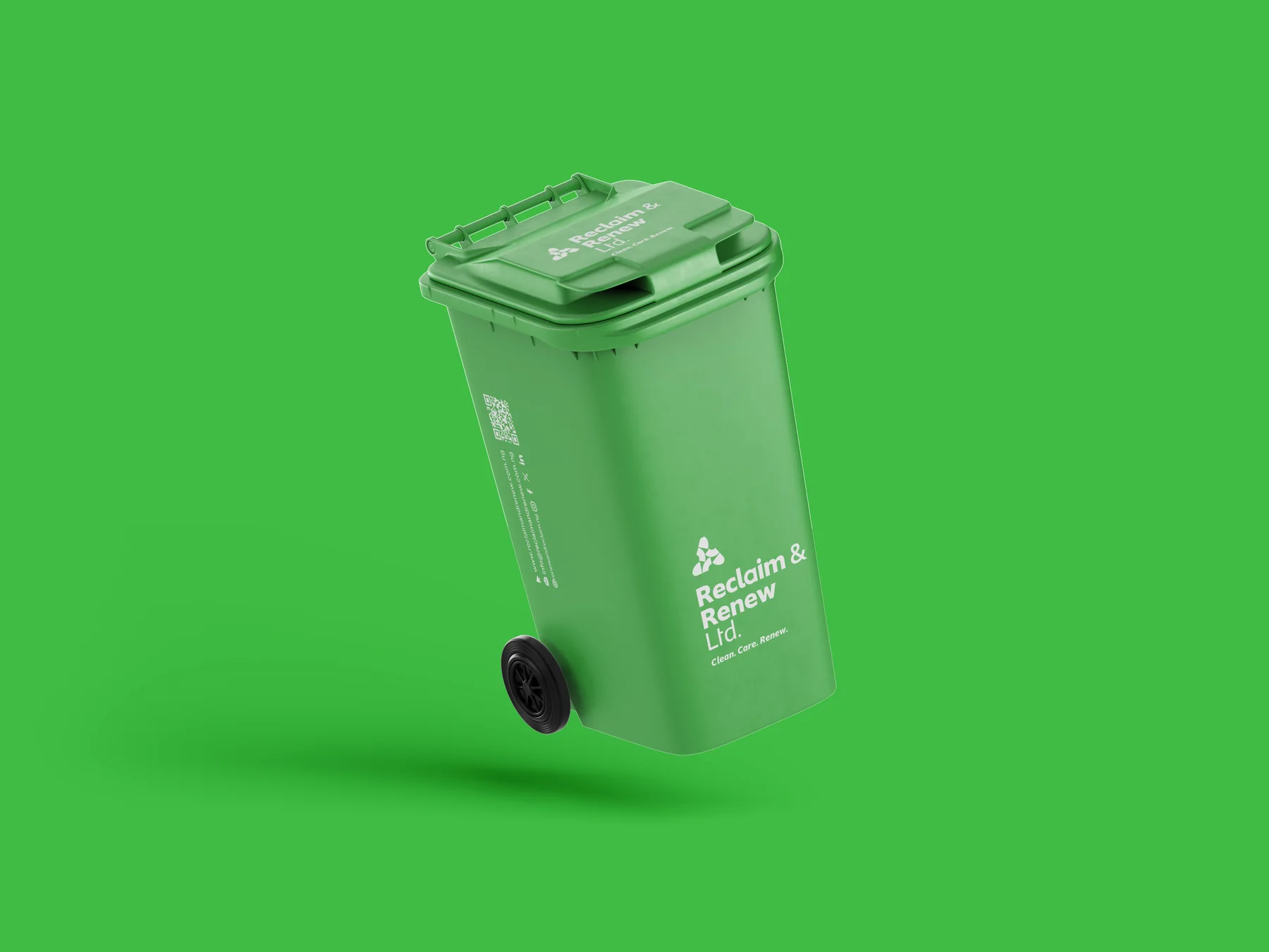
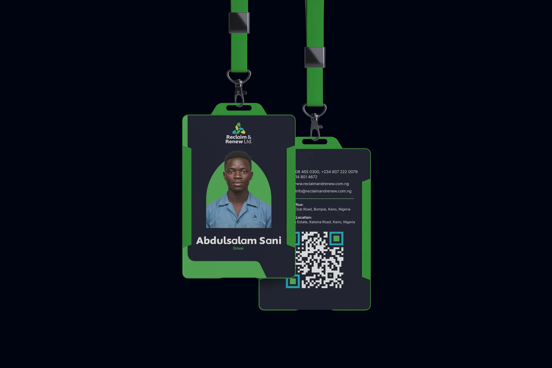
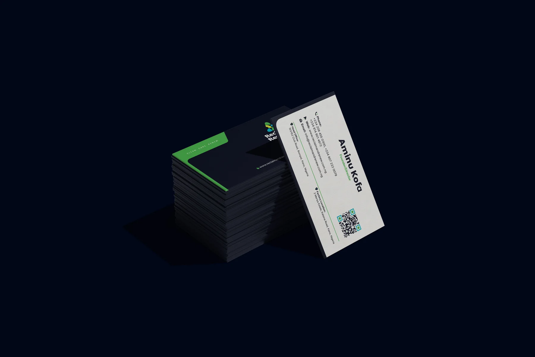
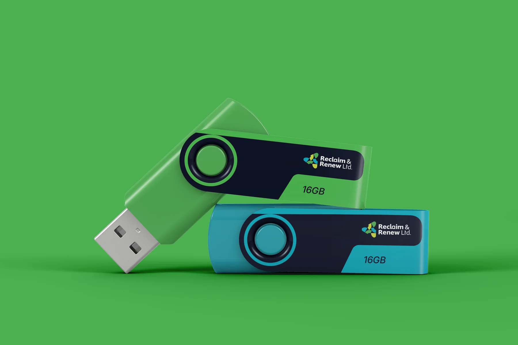
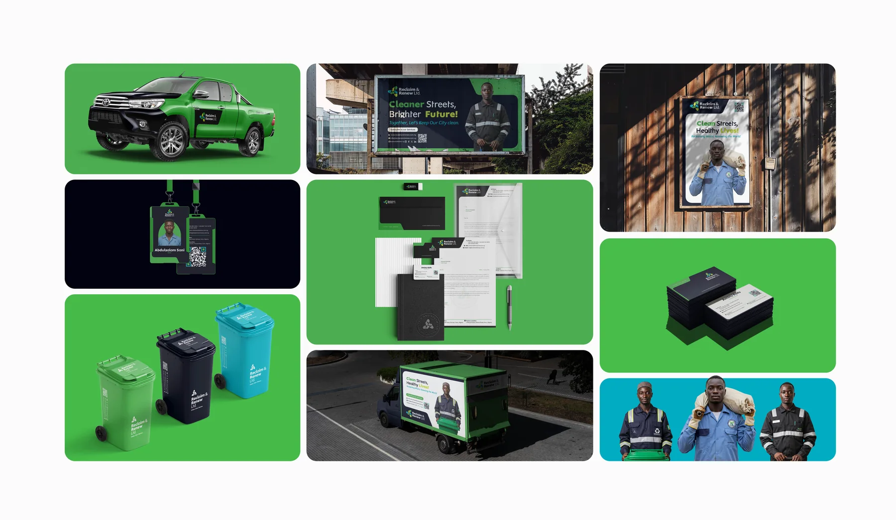
- 05Brand in useStationery, ID cards, uniforms, bins, signs, a truck and a pickup.
01 Inside the guide
THE THINKING,
PAGE BY PAGE.
Pick a page from the brand guidelines: how the mark is built, what it means, and the rules that keep it consistent.
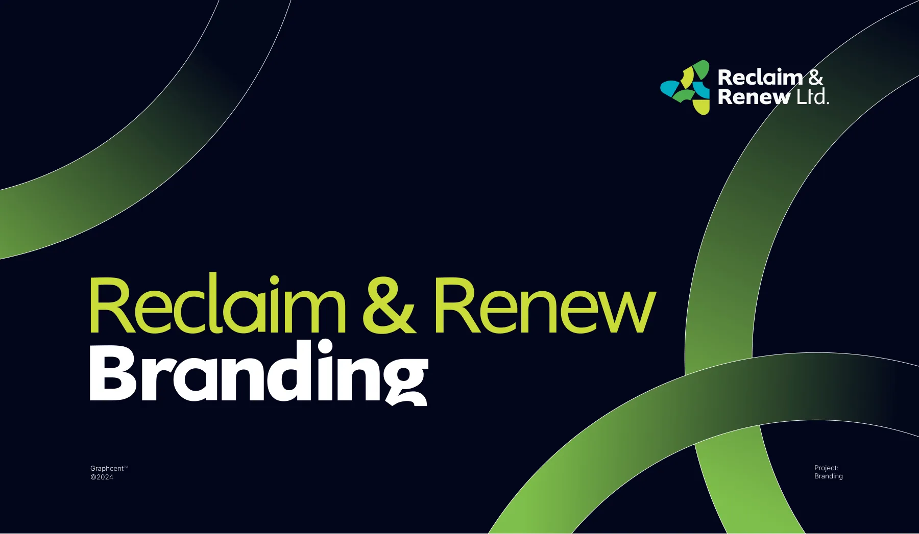
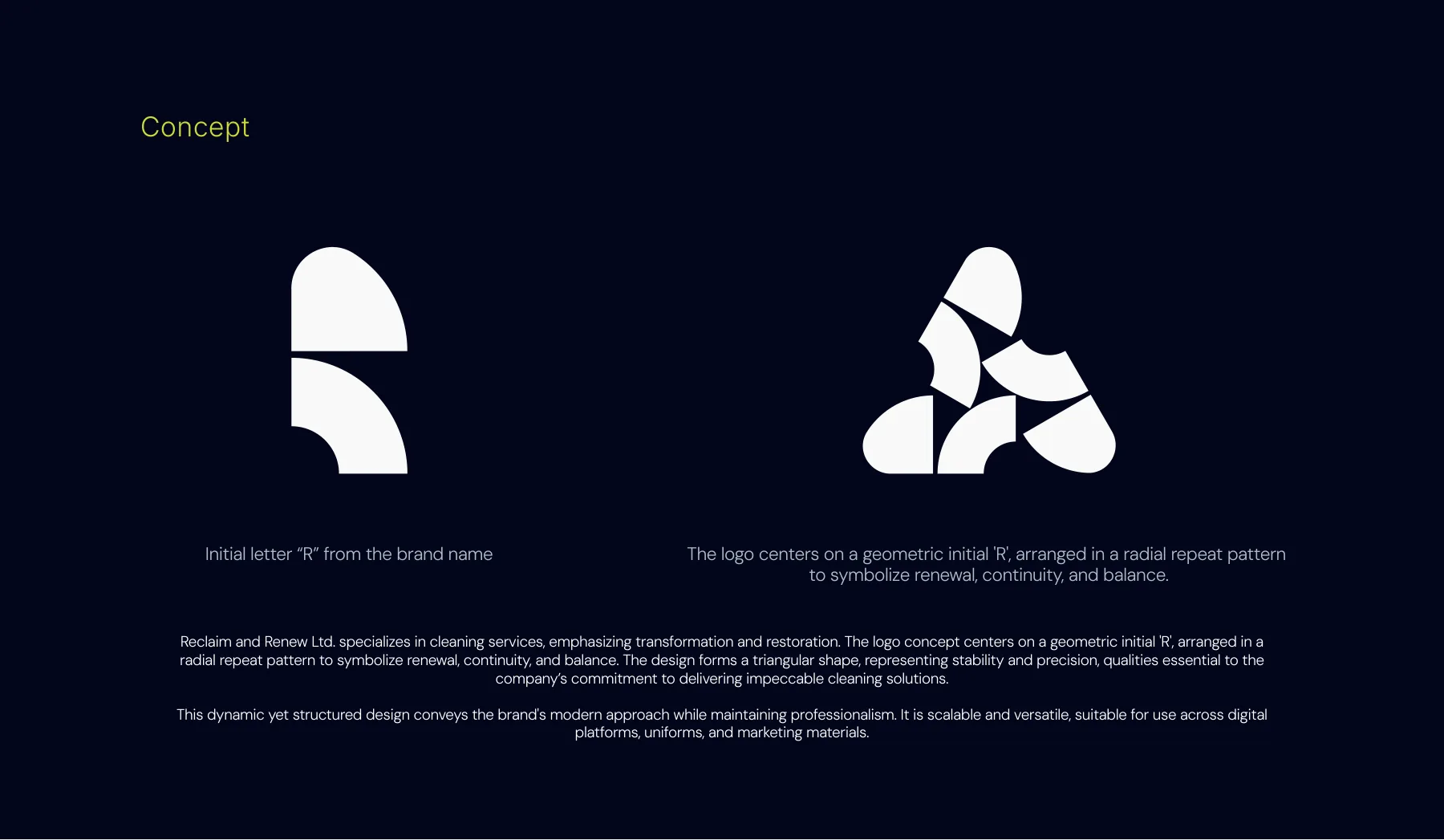

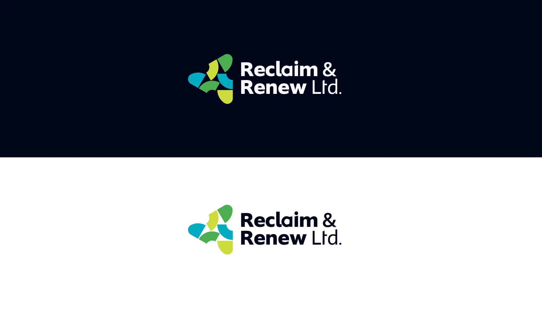
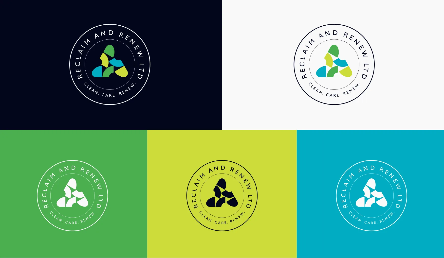
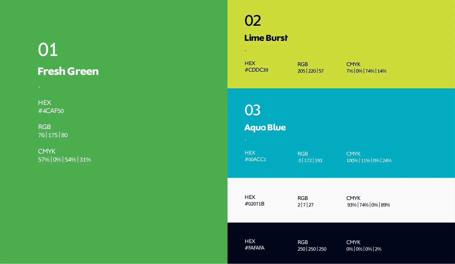
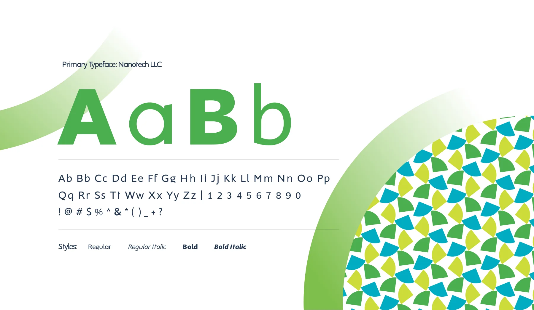
The Reclaim & Renew branding guide.
Download
Reclaim & Renew brand guidelines
For viewing only: contact details removed, not for reuse. © 2024 Reclaim & Renew Ltd.. Design by Graphcent.
02 Colour & type
THE PALETTE.
Tap a colour to copy it. Type: Nanotech.
Headings are set in Nanotech. See the typography page in the guide above.
03 In the world
THE BRAND
IN USE.
Where people meet it: billboard, street hoardings, truck, poster and more.
04 Deliverables
WHAT WE
DELIVERED.
Identity
- Radial R logomark
- Horizontal and vertical logos
- Circular emblems
- Five-colour palette
- Nanotech typography
Brand in use
- Stationery, business and ID cards
- Uniforms and caps
- Bins and safety signs
- Truck and pickup livery
- Building signage
Campaign
- Billboards
- Street hoardings
- Posters
Have a project in mind?
TELL US WHAT
YOU’RE BUILDING.
Launching, changing or starting something. Send a short note and we will come back with questions, a scope and a number.
SEND US A BRIEF