

DREAMS PHARMACY
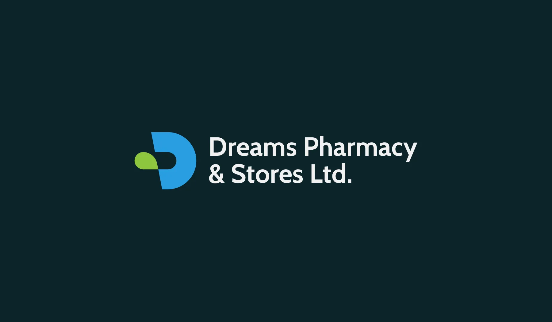
A pharmacy that wanted to look as trustworthy as the medicine it sells. We redrew its initial D so a capsule appears in the negative space.
The brief
Dreams Pharmacy & Stores Ltd. needed a modern, professional identity that communicates care and reliability, and works everywhere from a shopping bag to a delivery van.
The approach
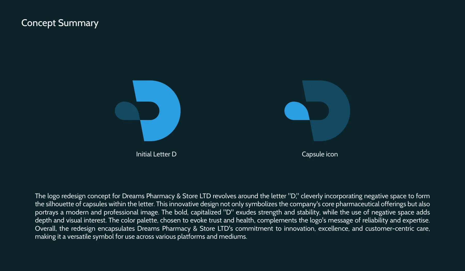
The new mark is a bold capital D. Inside it, negative space forms the silhouette of a capsule: the pharmacy’s core business in a single shape. Deep teal for trust, sky blue for health and lime green for wellbeing, set in Cabin.
Scope
- 01LogomarkA bold D with a capsule in its negative space.
- 02Logo lockupThe mark with the full company name.
- 03Colour & typeDeep teal, sky blue and lime green; Cabin.
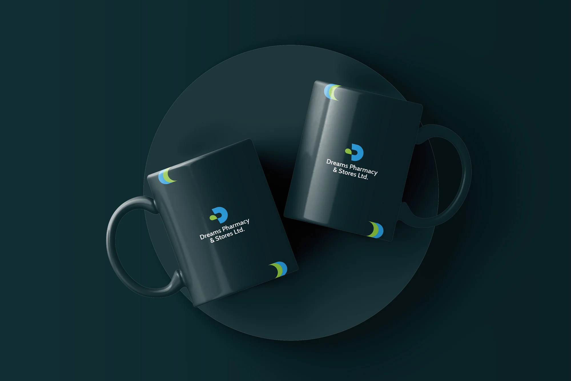
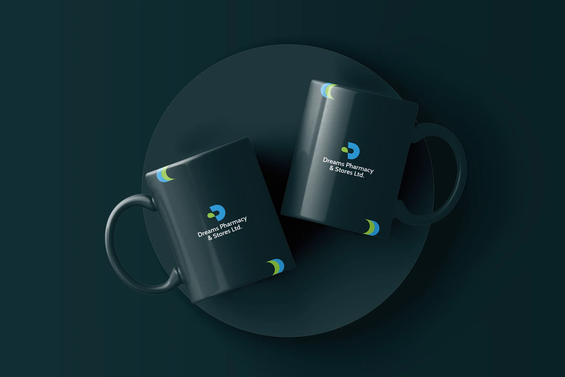
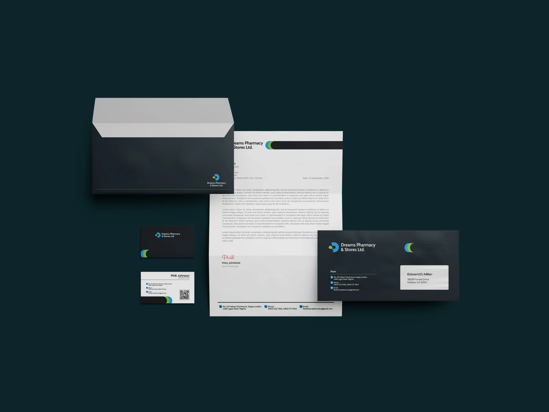
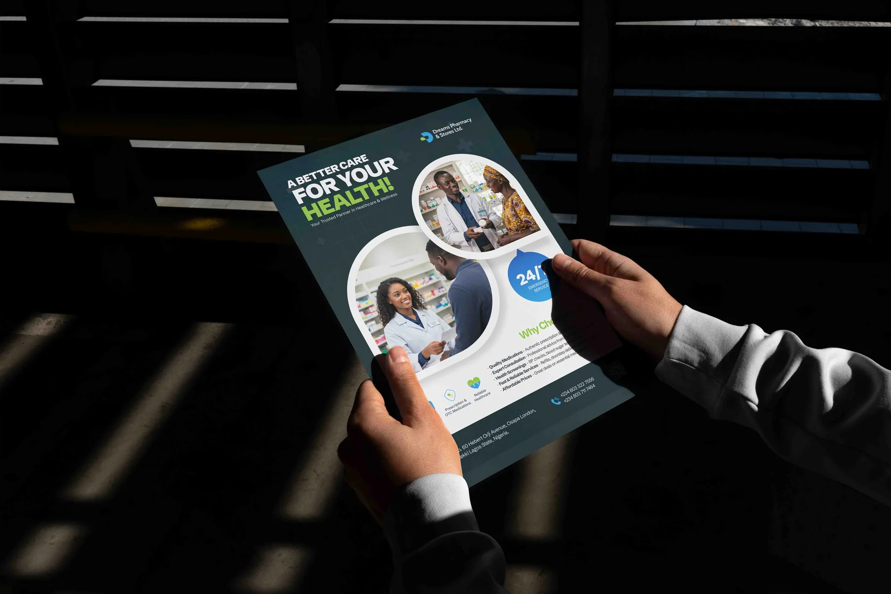
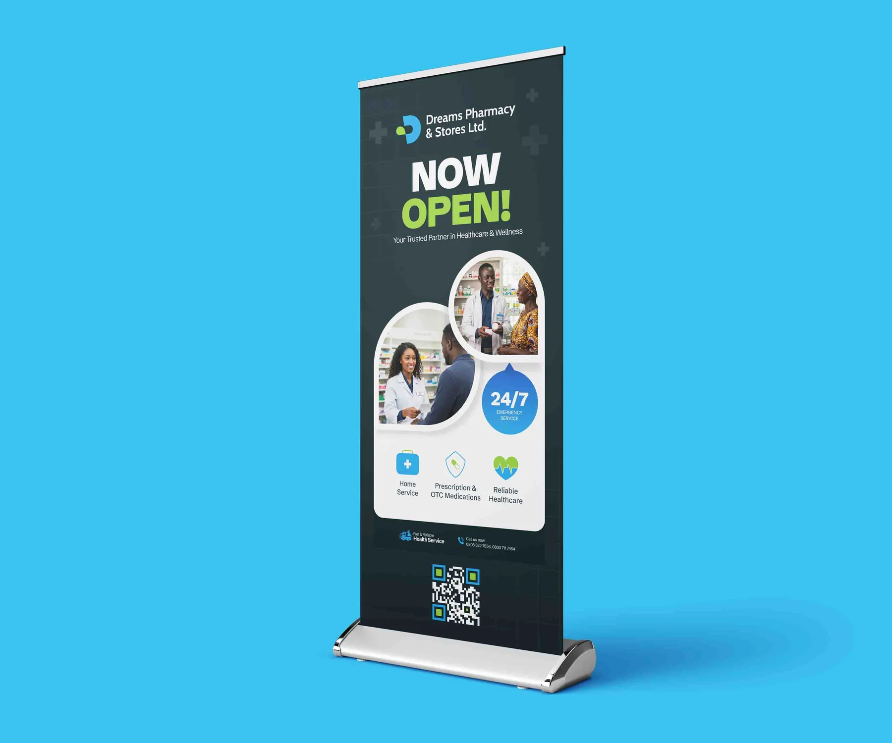
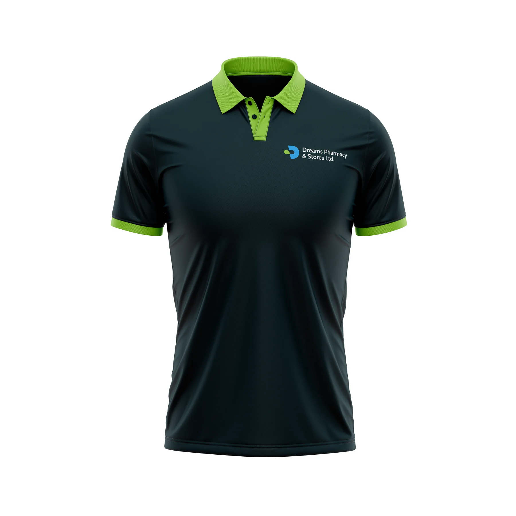
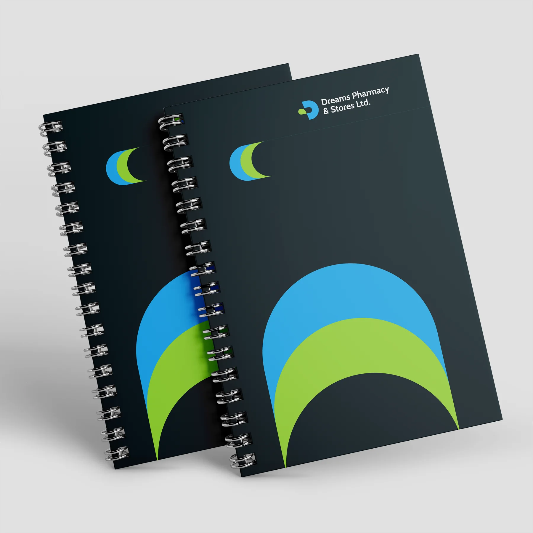
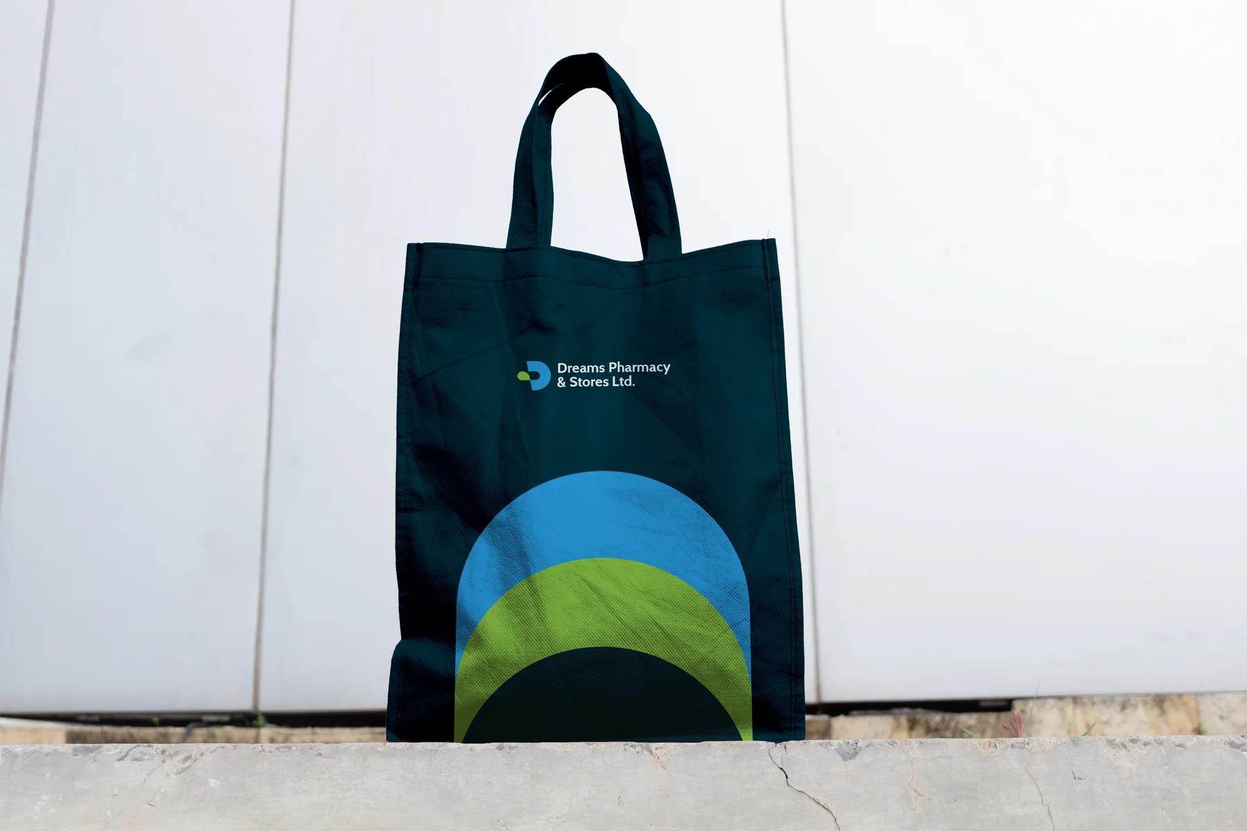
- 04Brand in useStationery, mugs, notebooks, tote bags, polo shirts, flyers, a roll-up and a van.
01 Inside the guide
THE THINKING,
PAGE BY PAGE.
Pick a page from the brand guidelines: how the mark is built, what it means, and the rules that keep it consistent.
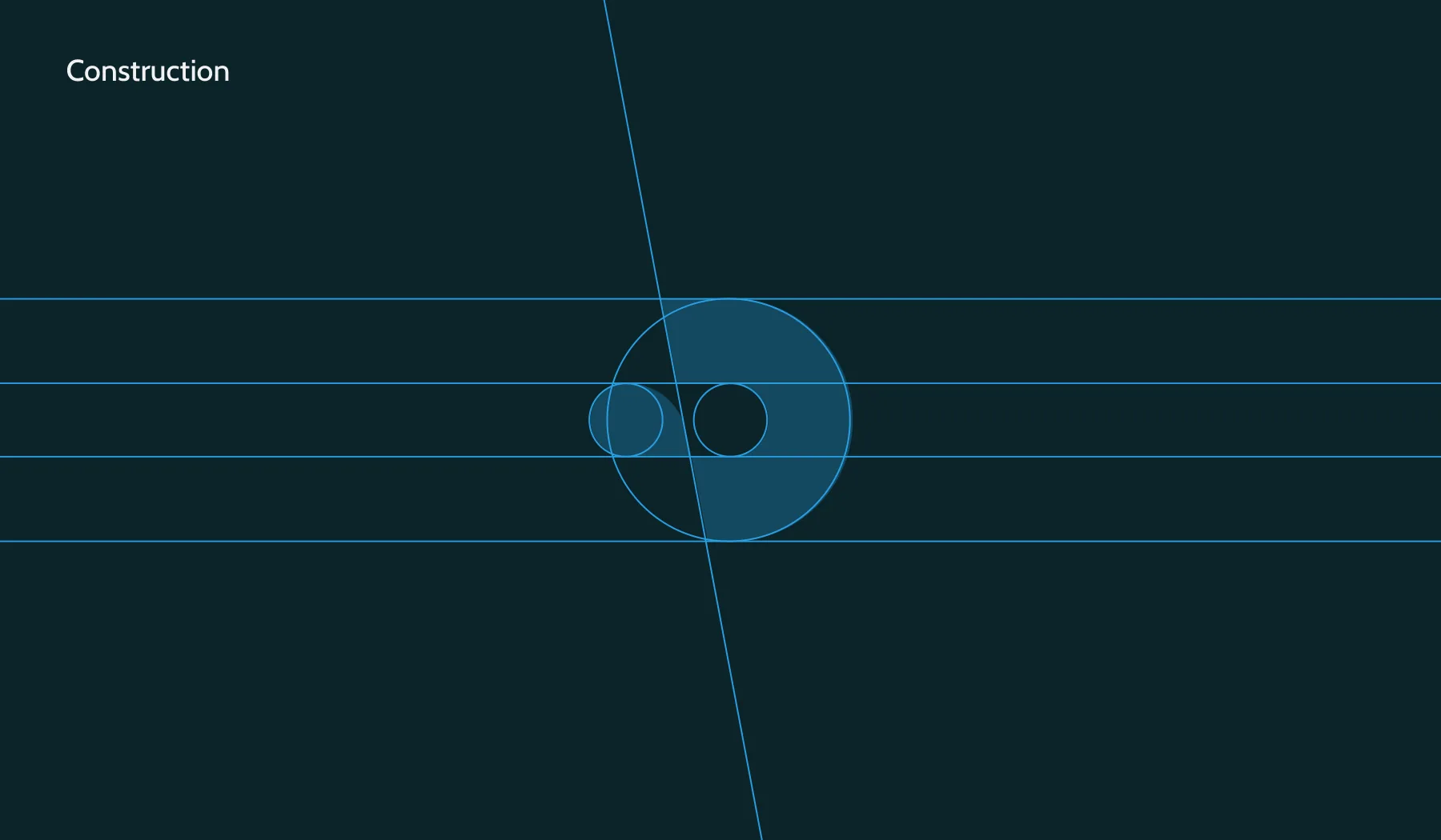
The D drawn from circles and lines.
Download
Dreams Pharmacy brand guidelines
For viewing only: contact details removed, not for reuse. © Dreams Pharmacy & Stores Ltd.. Design by Graphcent.
02 Colour & type
THE PALETTE.
Tap a colour to copy it. Type: Cabin.
Cabin
03 In the world
THE BRAND
IN USE.
Where people meet it: mugs, stationery, flyer, roll-up banner and more.

04 Deliverables
WHAT WE
DELIVERED.
Identity
- D-and-capsule logomark
- Logo lockup
- Colour palette
- Cabin typography
Brand in use
- Stationery
- Mugs and notebooks
- Tote bags and polo shirts
- Flyers and a roll-up banner
- Delivery van livery
Have a project in mind?
TELL US WHAT
YOU’RE BUILDING.
Launching, changing or starting something. Send a short note and we will come back with questions, a scope and a number.
SEND US A BRIEF