

GURASAR BANƊASHE
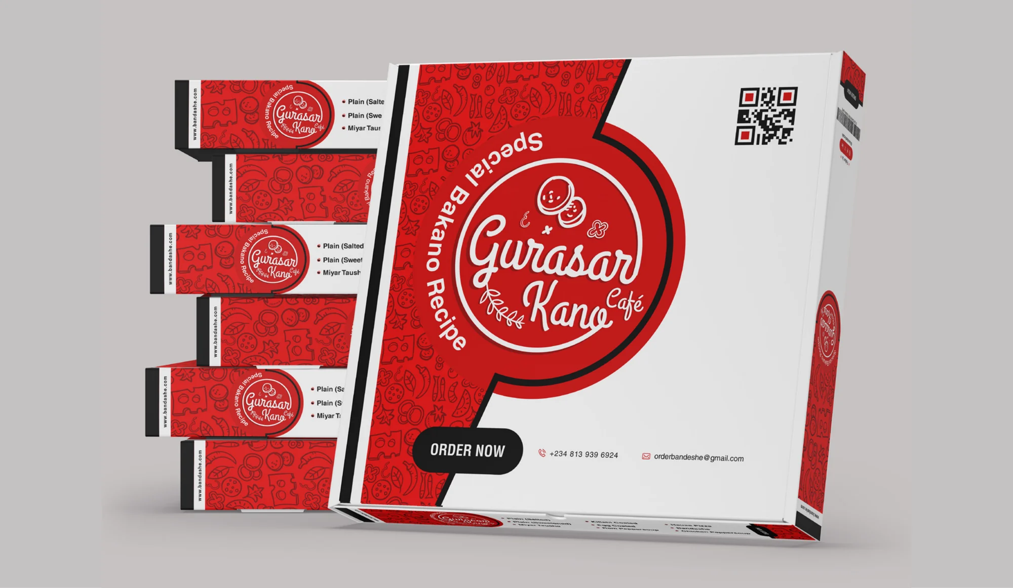
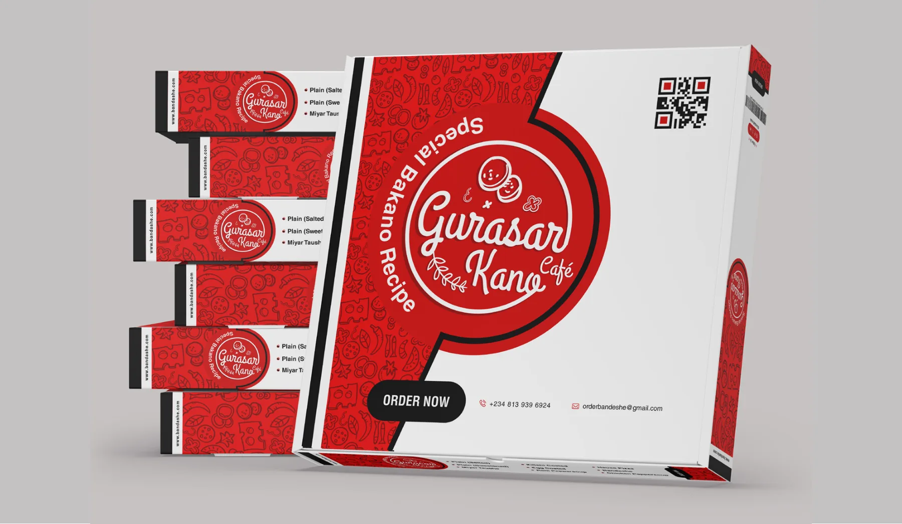
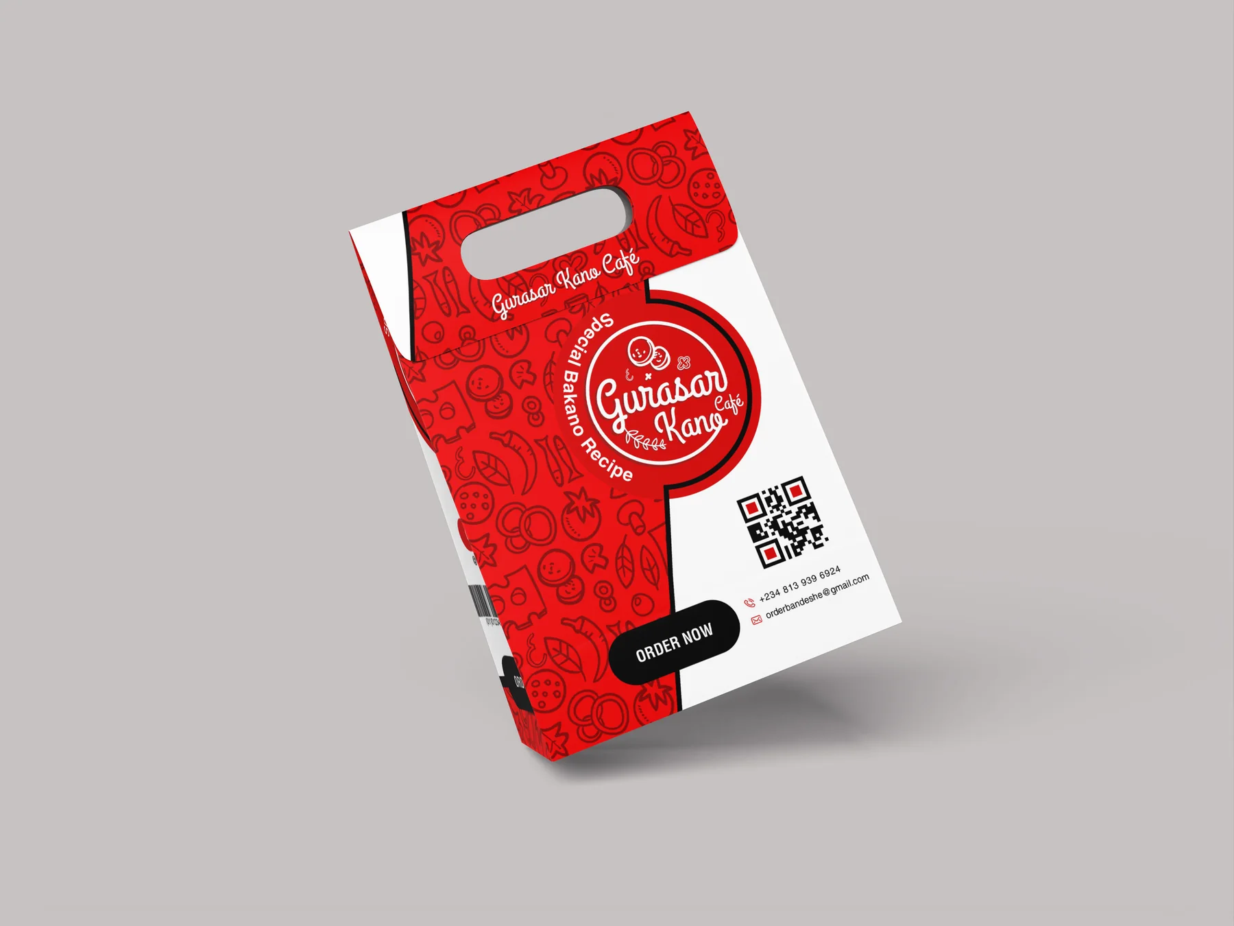
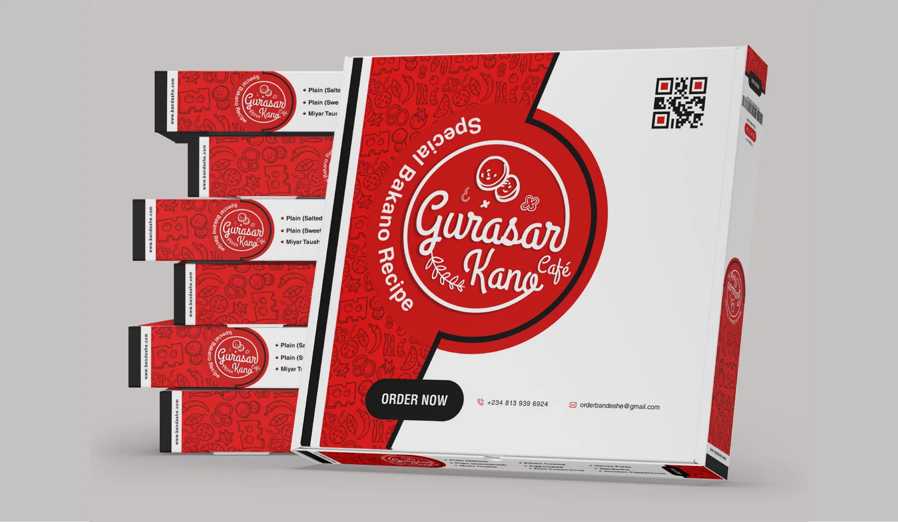
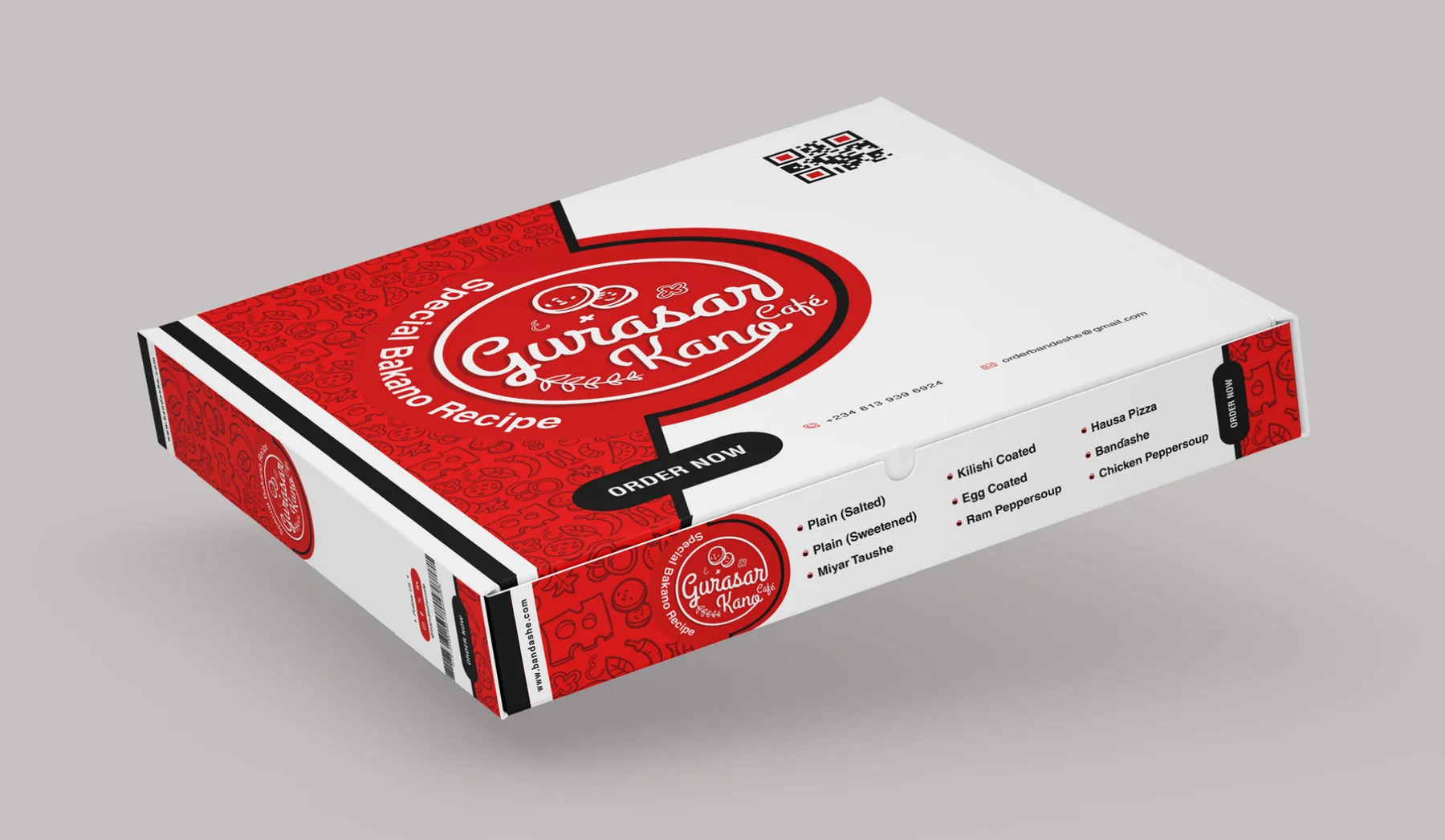
Packaging for a Kano café: a pizza box and a takeaway bag as bold and warm as the food inside.
The brief
The café needed packaging that stands out on a counter and on the street, carries the brand on every side, and tells customers how to order again.
The approach
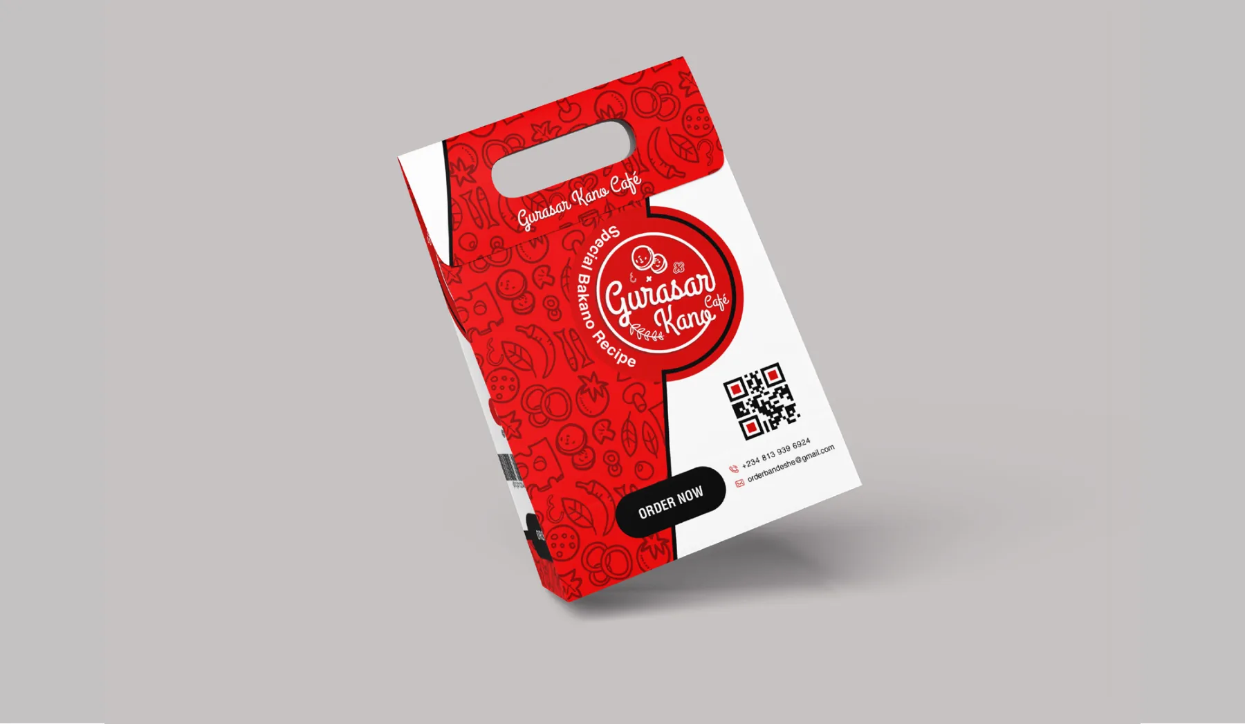
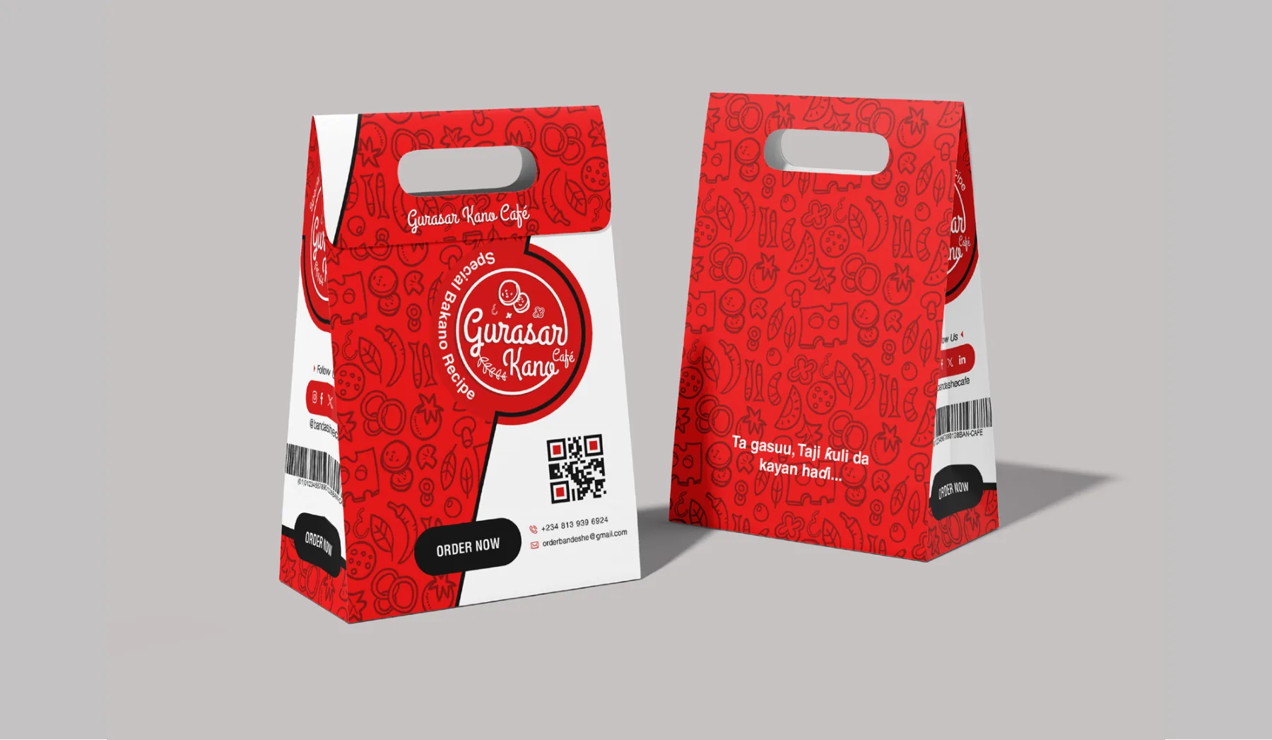
We wrapped everything in one bold red, with a hand-drawn pattern of food icons and a round badge for the script logo. Clean white panels hold the menu, the QR code and the Order now call to action.
Scope
- 01Pizza boxTop, sides and menu panels, with the badge, pattern and QR code.
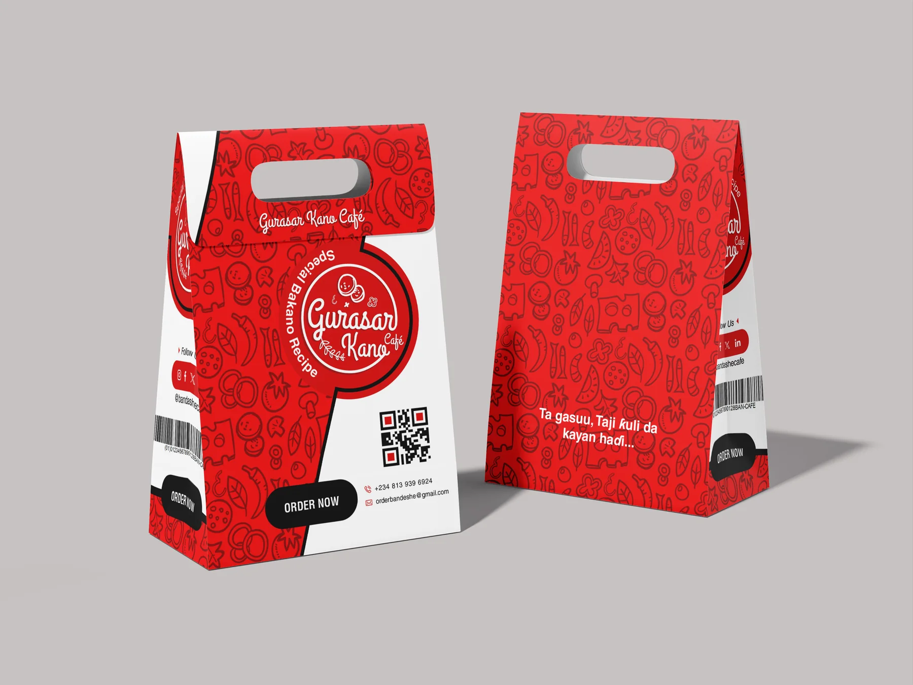
- 02Takeaway bagA handled bag in red and white with the badge and order details.
- 03PatternA hand-drawn repeat of food icons in red.
- 04DielinesFlat artwork for printing.
01 Inside the guide
THE THINKING,
PAGE BY PAGE.
Pick a page from the packaging presentation: how the mark is built, what it means, and the rules that keep it consistent.
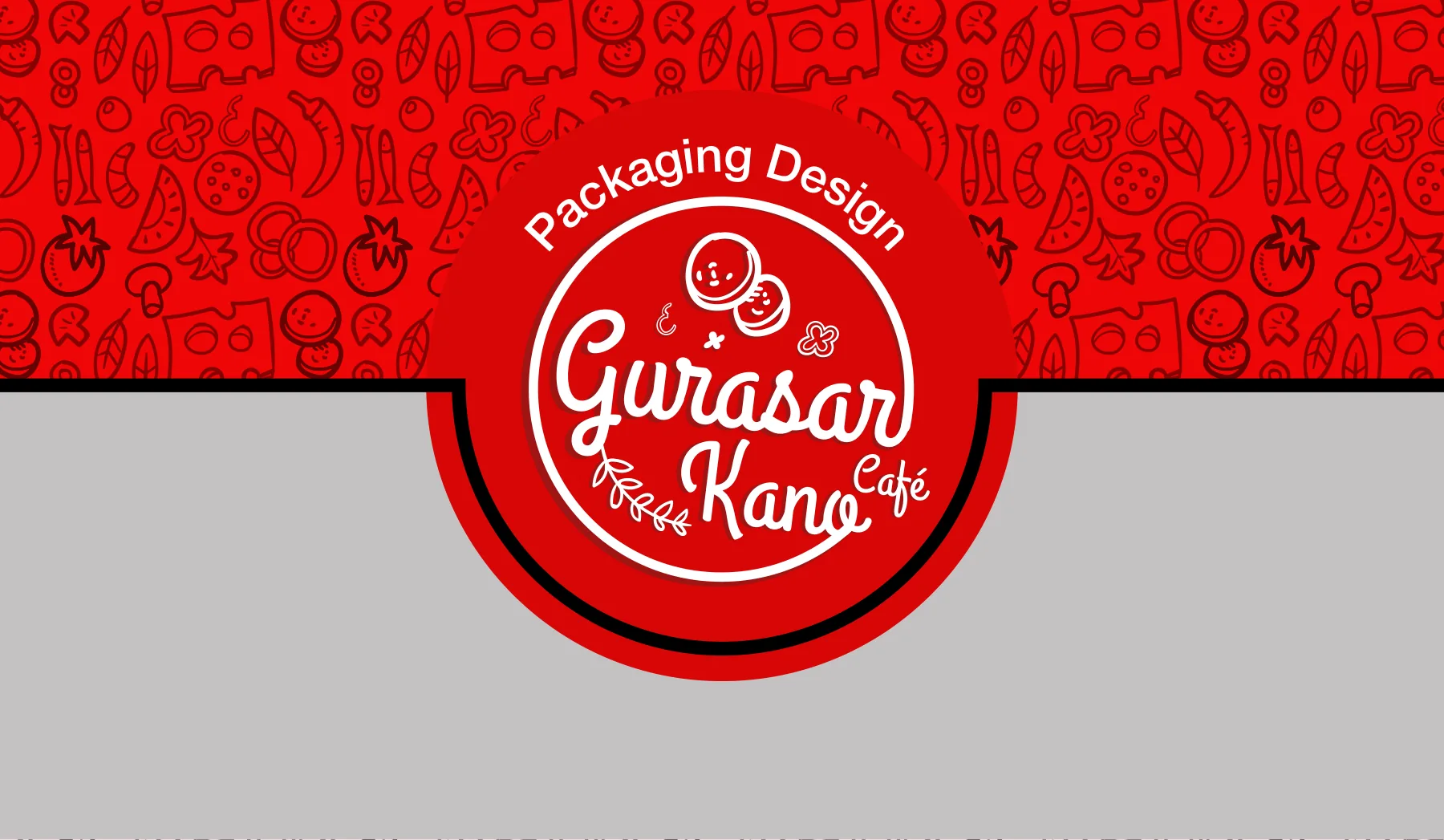
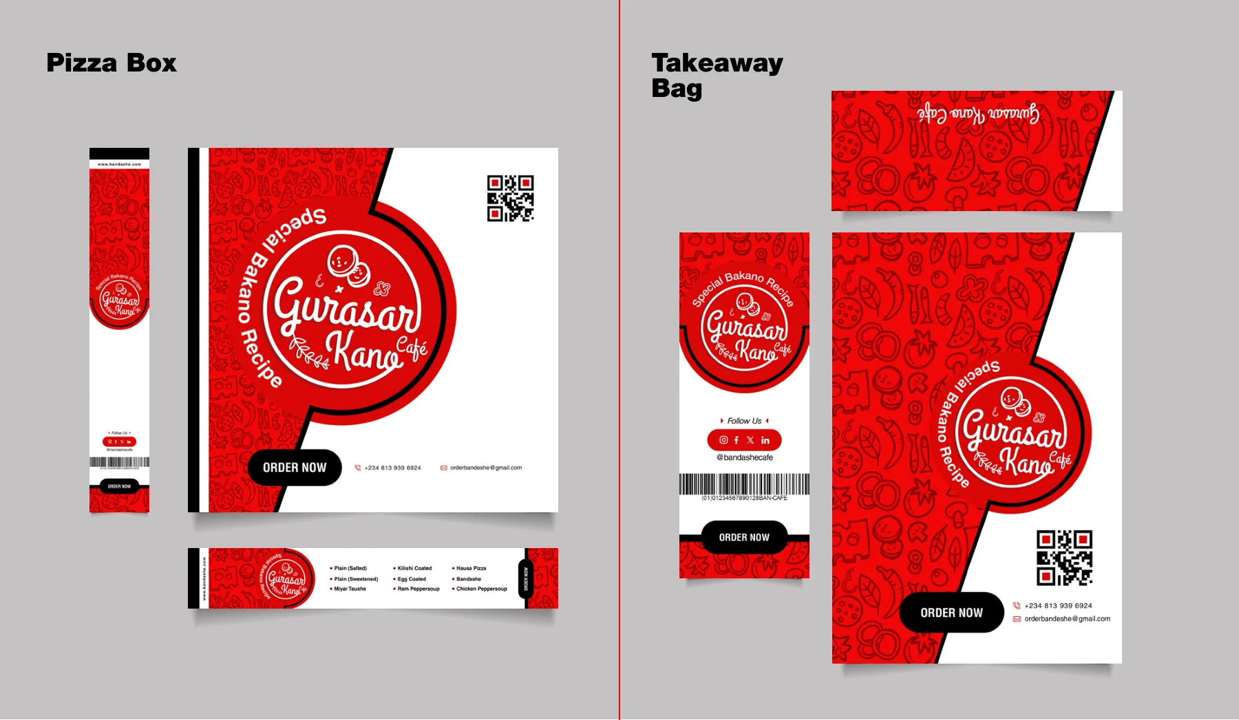
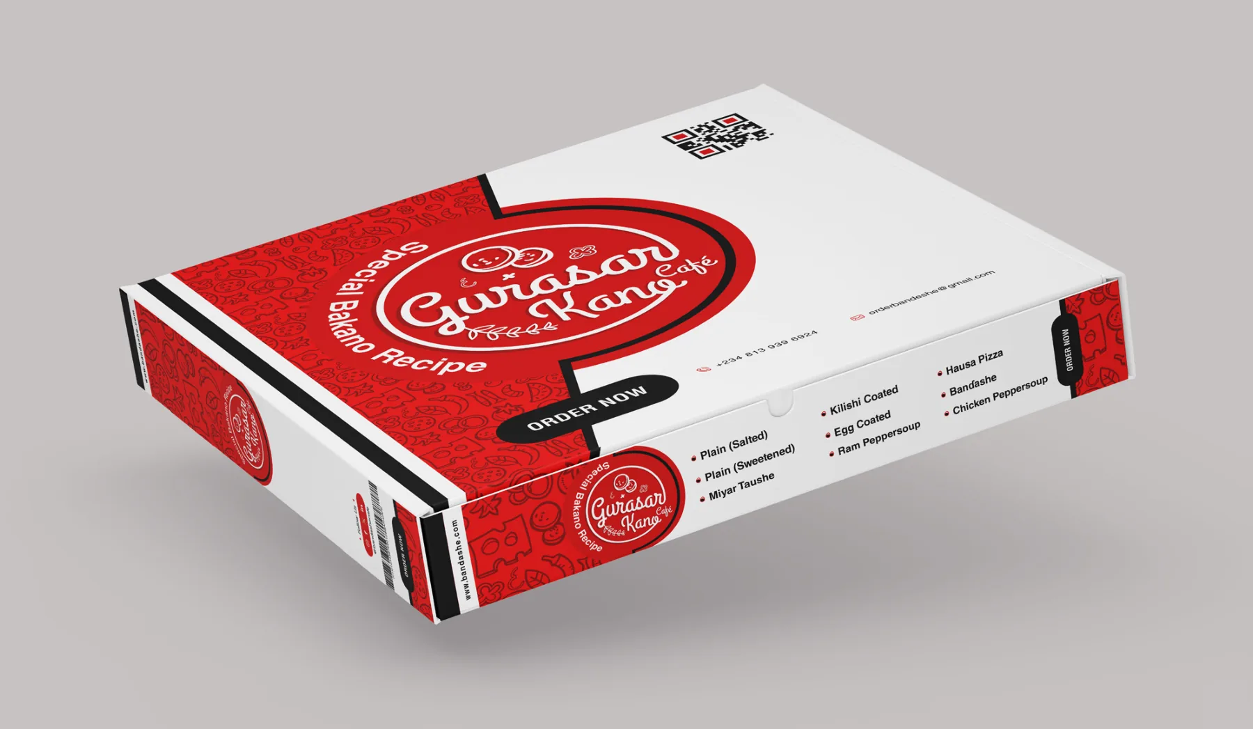
The packaging presentation.
Download
Gurasar Banɗashe packaging presentation
For viewing only: contact details removed, not for reuse. © Gurasar Banɗashe. Design by Graphcent.
02 Colour & type
THE PALETTE.
Tap a colour to copy it. Type: Grand Hotel.
Grand Hotel
03 In the world
THE BRAND
IN USE.
Where people meet it: takeaway bags, takeaway bag, pizza boxes, pizza box and more.
04 Deliverables
WHAT WE
DELIVERED.
Packaging
- Pizza box
- Takeaway bag
- Food-icon pattern
- Badge logo lockup
- Print-ready flat artwork
Have a project in mind?
TELL US WHAT
YOU’RE BUILDING.
Launching, changing or starting something. Send a short note and we will come back with questions, a scope and a number.
SEND US A BRIEF