

PEGASUS
INTERIORS
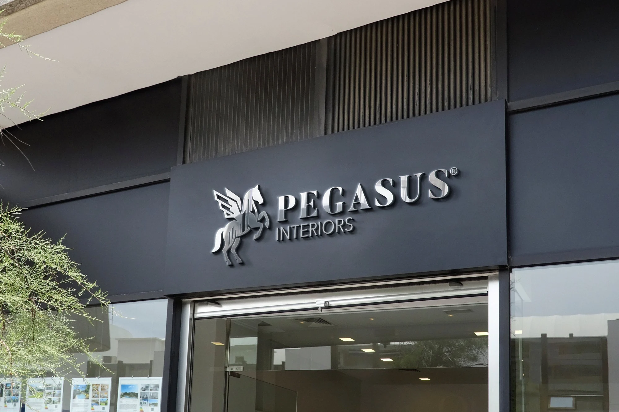
Pegasus Interiors came to Graphcent with a logo the whole team liked, and one request: something better. We gave them more than a better logo. We built a brand identity: a logo system, an emblem, a palette and stationery, ready to grow into everything the business touches.
The brief
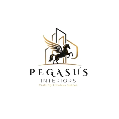
Pegasus Interiors, an interior design company in Kano, reached out on WhatsApp with their existing logo: a winged horse in front of building outlines. “We all like it,” they said. “It’s just that we want something better.”
The approach
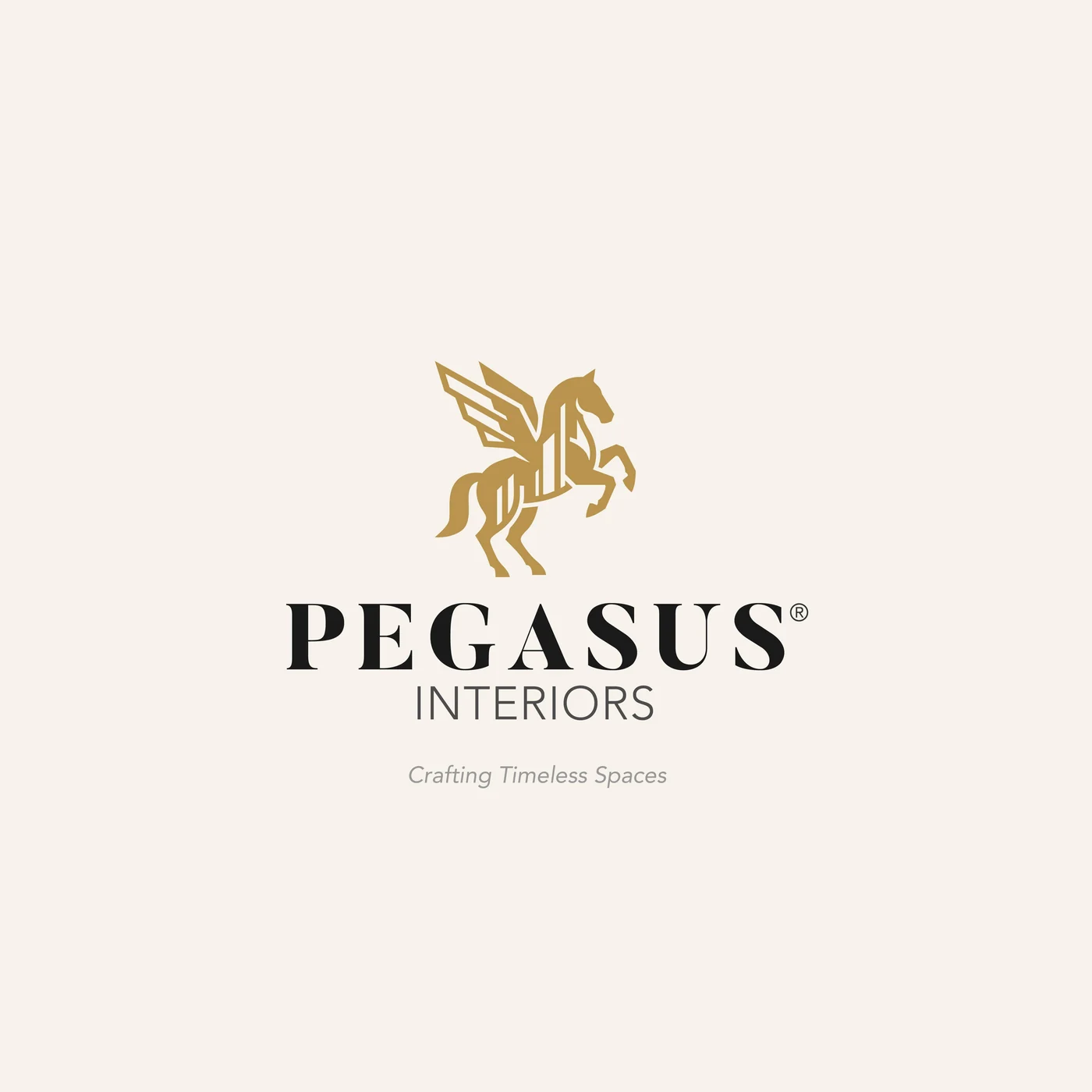
Keep what they loved, the Pegasus and the gold, and rebuild it so it works everywhere. The buildings moved inside the horse: one solid, single-colour symbol that holds up on a favicon, a business card and a billboard. Around it we built the system a brand actually runs on.
Scope
- 01Brand symbolThe Pegasus redrawn as one solid shape, with the architecture carried inside the body. Full colour and mono.
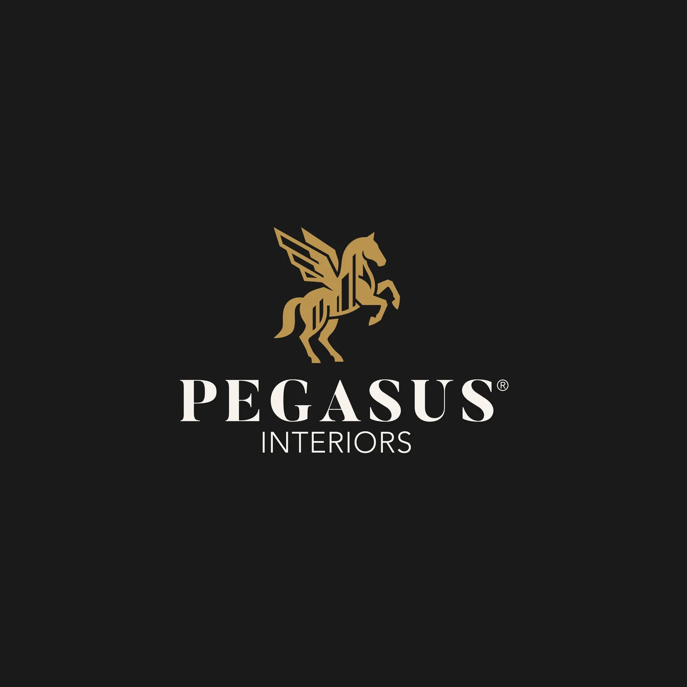
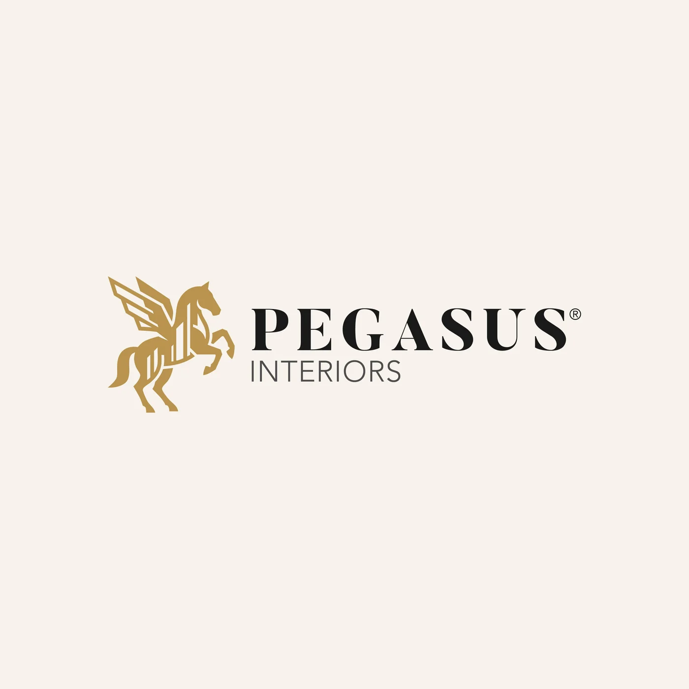
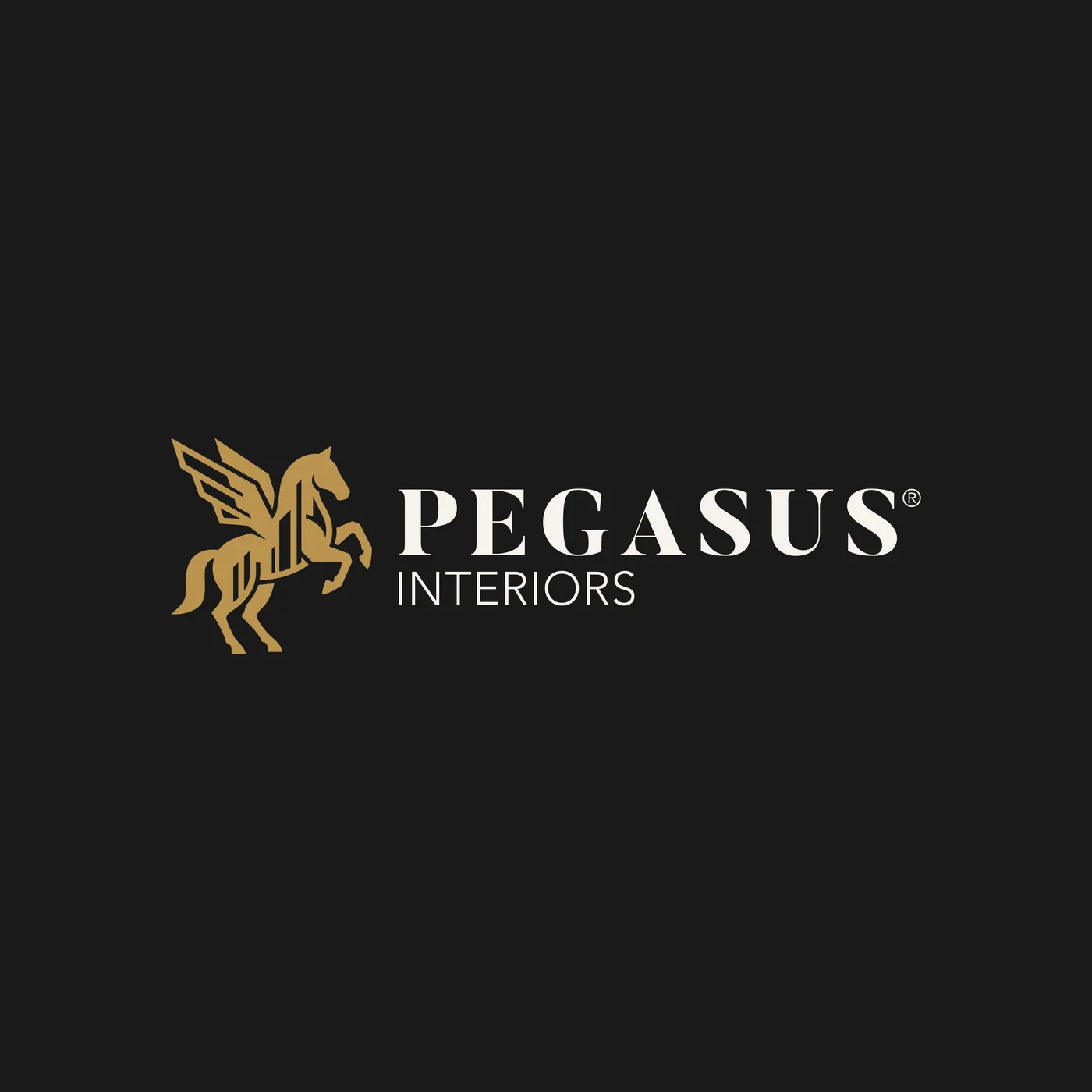
- 02Logo systemStacked and horizontal lockups, with and without the tagline, on light and dark.
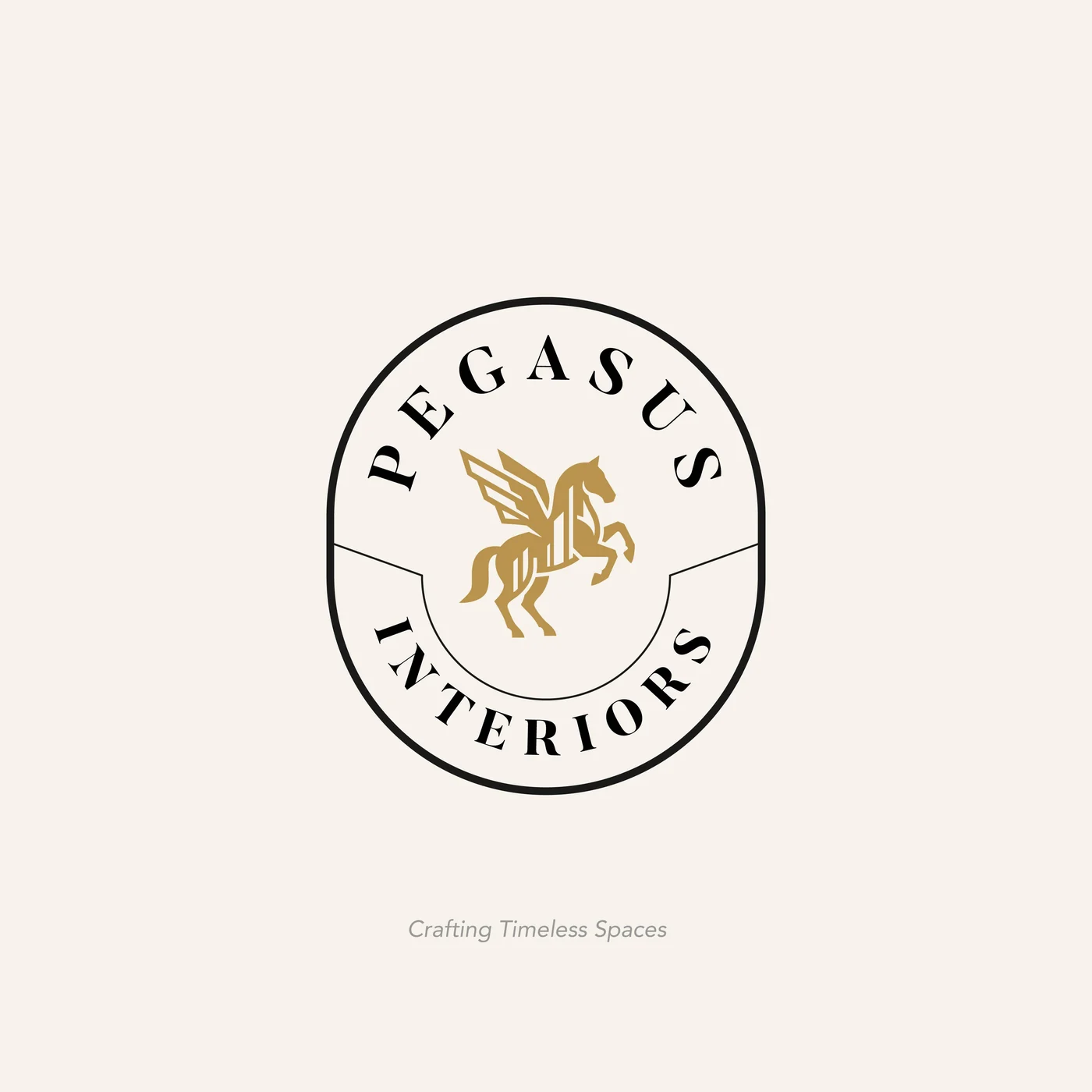
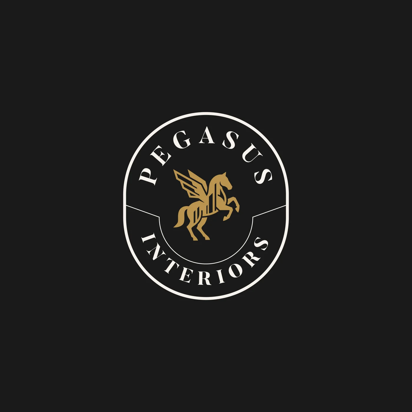
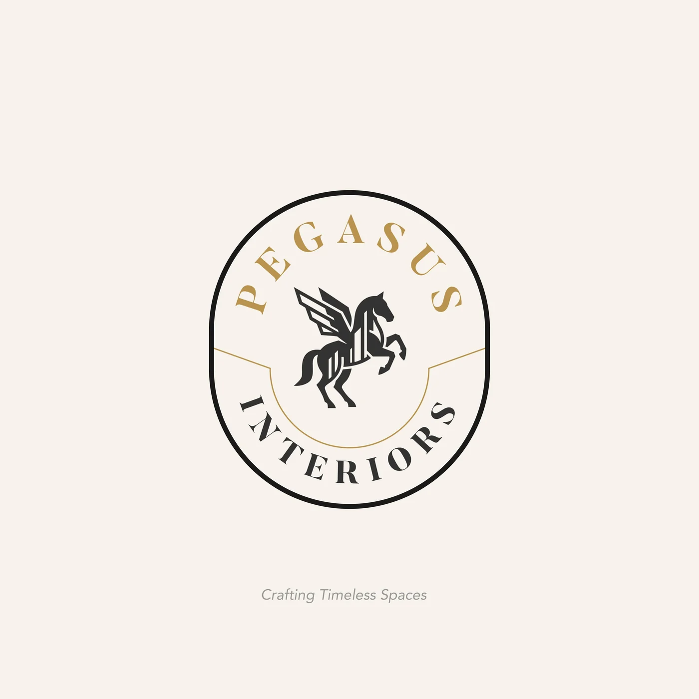
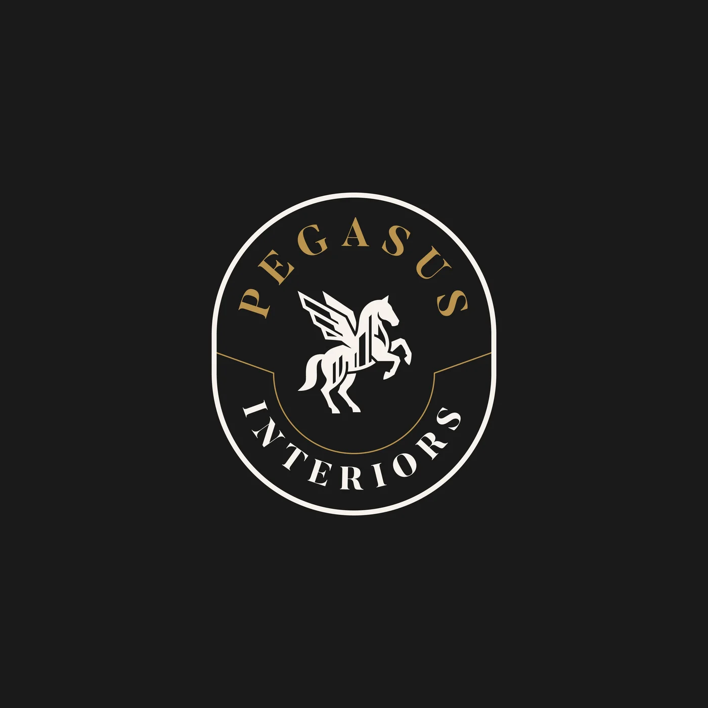
- 03EmblemTwo circular seals for stamps, packaging, watermarks and uniforms, on light and dark.
- 04ColourPegasus Gold, Charcoal, Cream and Stone: warm, calm and premium, like the spaces they design.
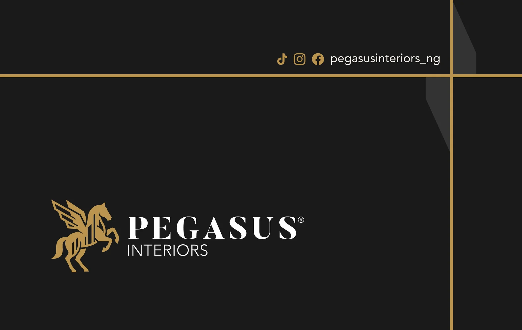
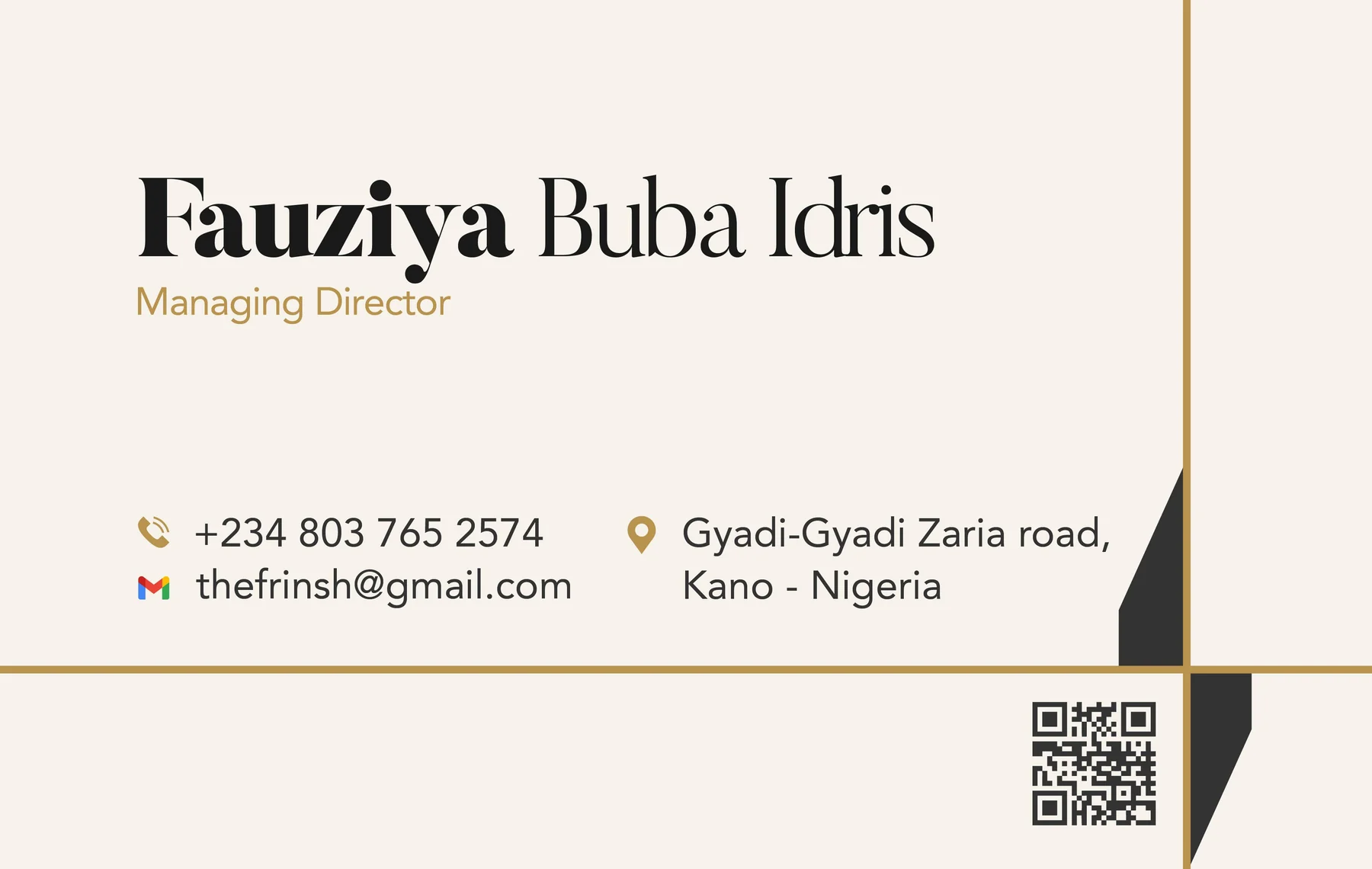
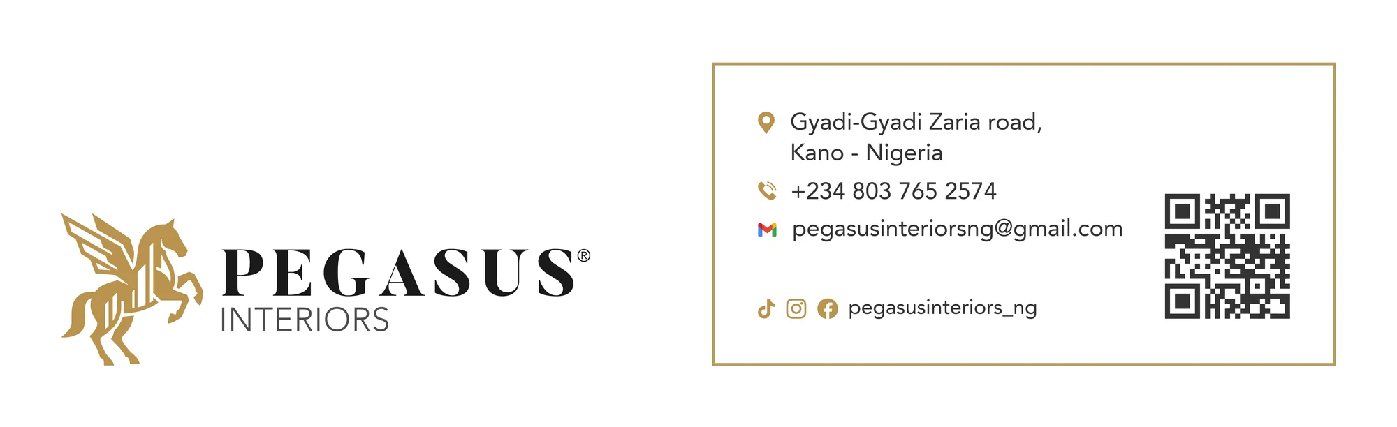
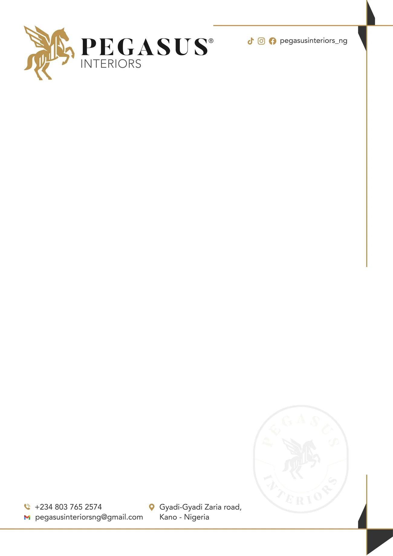
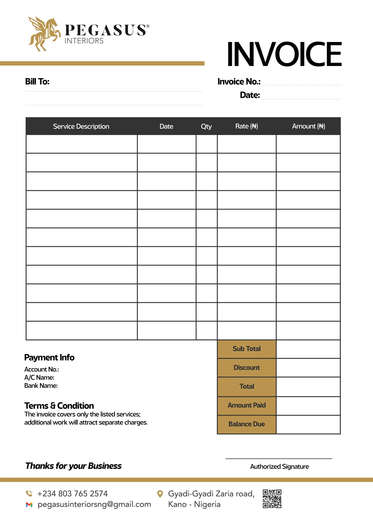
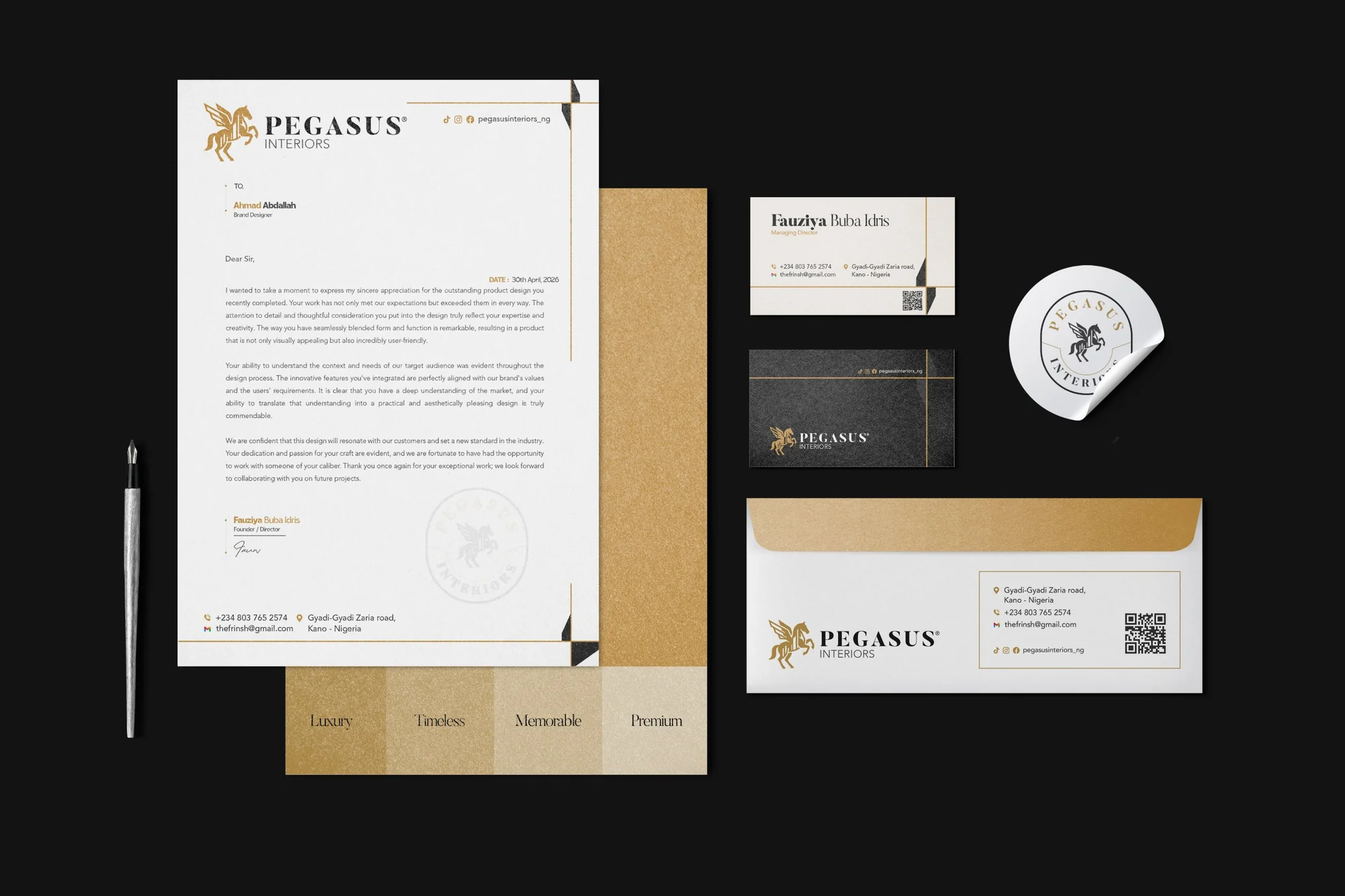
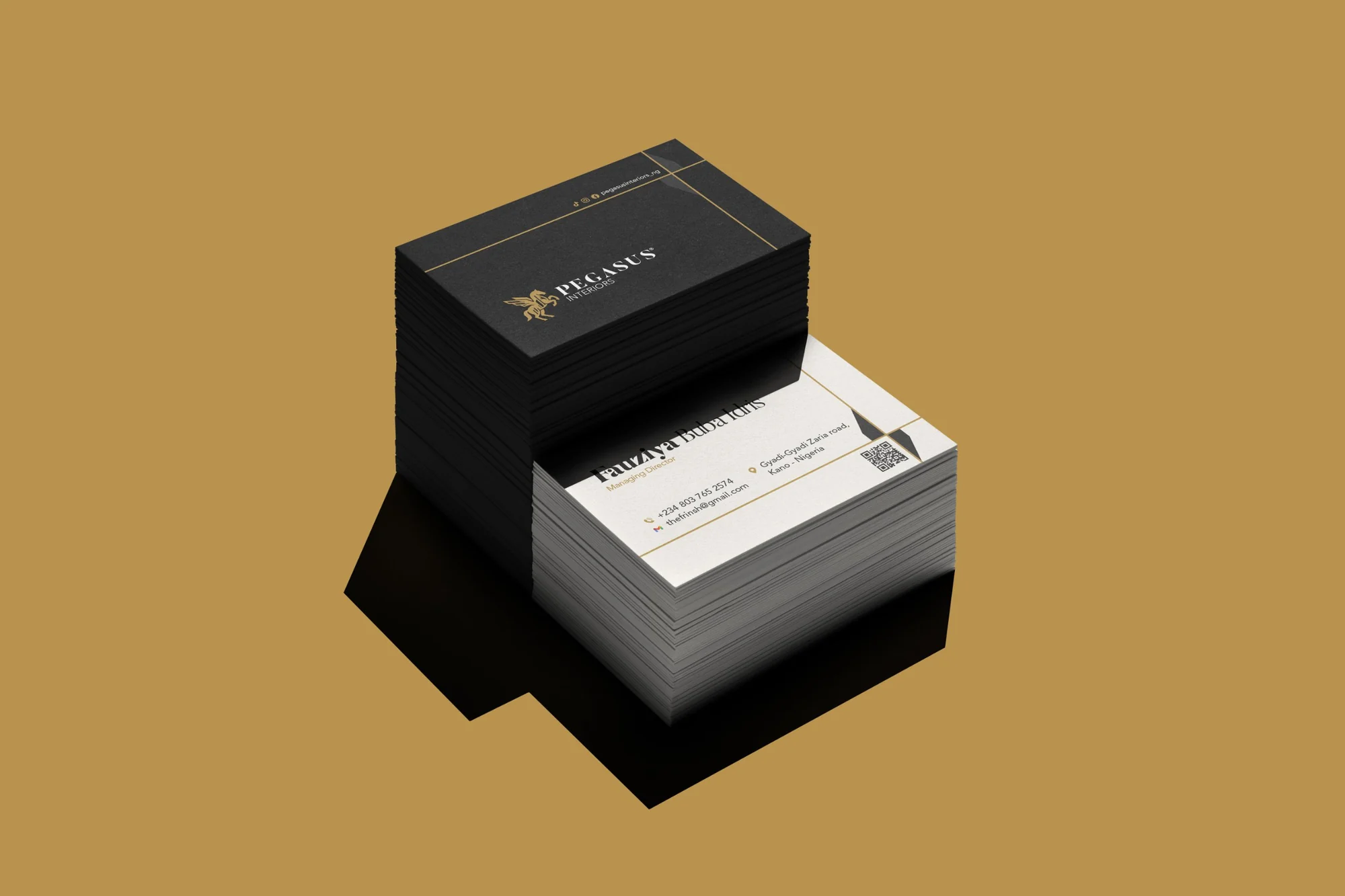
- 05StationeryBusiness card, letterhead, invoice and envelope, with the emblem as a watermark.
01 Before and after
SAME SPIRIT.
STRONGER MARK.
Drag across to compare the logo Pegasus Interiors had with the one we designed.
02 Logo system
ONE MARK,
MANY JOBS.
Choose a version, then see it on light and dark.
03 Size test
BUILT TO WORK
AT ANY SIZE.
A logo lives on a browser tab as much as on a billboard. Shrink both marks and watch which one holds.
04 Colour
GOLD, CHARCOAL
AND CREAM.
Four colours, picked from the materials of a well-finished room: brass, dark timber, warm plaster and stone. Tap a colour to copy it.
05 Stationery
THE BRAND,
ON PAPER.
The first things a client holds: a card, a letter, an invoice. Gold rules and a faint emblem watermark tie them together.
06 In the world
FROM THE SIGN
TO THE DOOR.
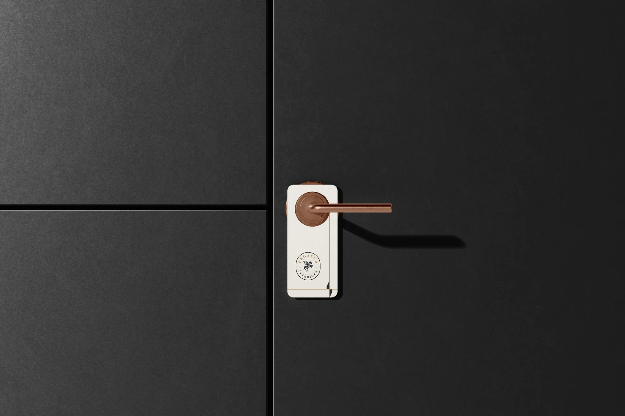
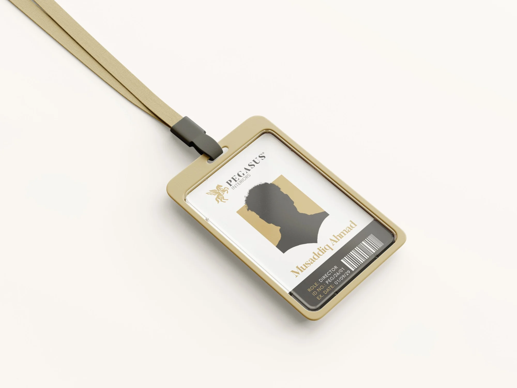
The identity where clients and staff actually meet it: above the shopfront, in a stack of cards, on a door, around a neck.
07 Deliverables
WHAT WE
DELIVERED.
A light identity package: the essentials a growing business needs to show up the same way on a card, a letter, a door and a shopfront.
Logo
- Brand symbol, full colour and mono
- Stacked logo
- Horizontal logo
- Tagline version
- Two circular emblems
- Light and dark versions
Stationery
- Business card
- Letterhead
- Invoice
- Envelope
- Emblem watermark
Brand in use
- Shop signage
- Door hanger
- Staff ID card
- Emblem sticker
Have a project in mind?
TELL US WHAT
YOU’RE BUILDING.
Launching, changing or starting something. Send a short note and we will come back with questions, a scope and a number.
SEND US A BRIEF