Branding · Case story

Why a logo is not a brand

A logo is the signature. The brand is everything the signature is attached to. When Pegasus Interiors asked us for a better logo, the most useful thing we could give them was the difference between the two.

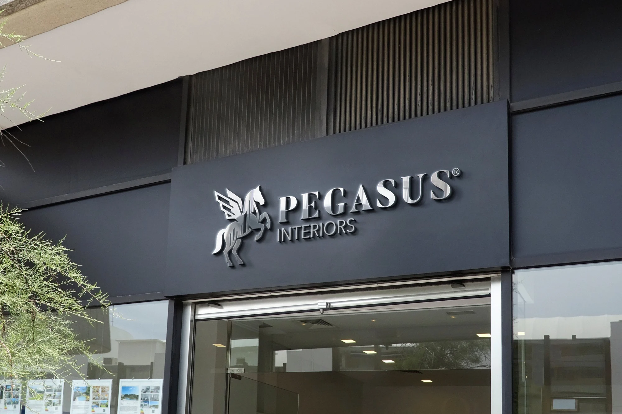
The Pegasus Interiors logo as brushed-steel letters on a charcoal shopfront sign
The new Pegasus Interiors mark above the shopfront. See the full case study.

It started with a WhatsApp message

Most of our projects begin somewhere less formal than a brief, and this one began in a chat. Pegasus Interiors, an interior design company in Kano, sent us their logo: a winged horse rearing in front of thin gold building outlines, the name set in a light, spaced-out serif, and the line “Crafting Timeless Spaces” underneath.

Then came the sentence that every designer has heard in some form:
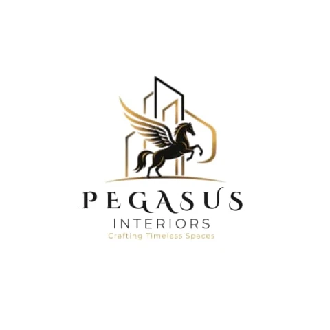
The previous Pegasus Interiors logo
This was the previous design
We all like it. It’s just that we want something better

It is a more honest brief than it sounds. Nobody disliked the logo. What they could not put into words was that it was not doing enough for them. That gap, between a mark people like and a mark that works, is the difference between a logo and a brand.

What “better” actually meant

Before drawing anything, we listed every place this logo would have to live. A business card. An invoice sent to a client. The sign above the studio. The side of a van. Embroidery on a staff shirt. An Instagram avatar the size of a fingernail. A browser tab smaller than that.

The old logo was drawn for one of those places: large, on white, in full colour. Its gradient wings and hairline buildings were lovely at that size and lost almost everywhere else. Shrink it and the buildings vanish. Print it in one colour and the wings turn to a blur. Stitch it onto a uniform and the detail has nowhere to go.
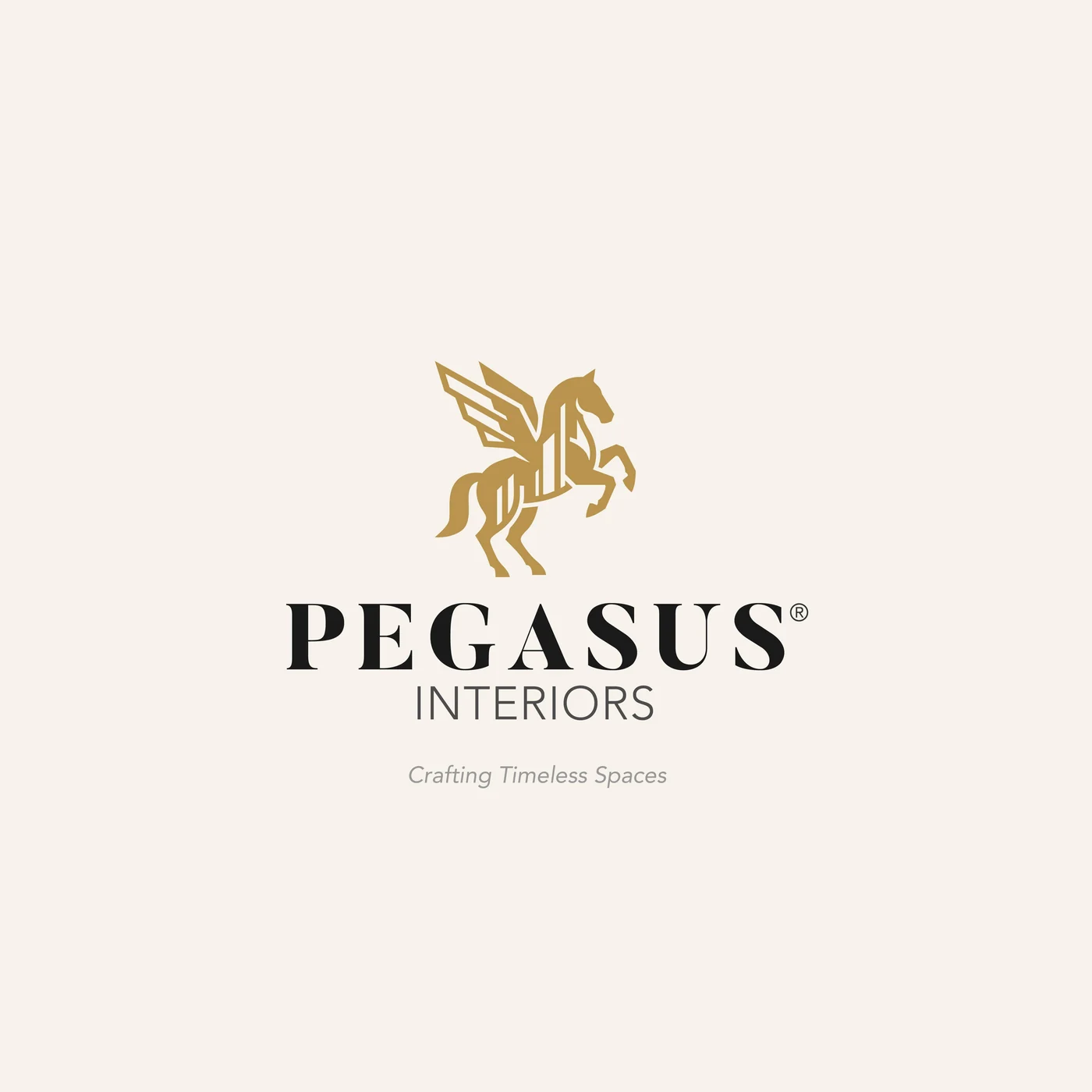
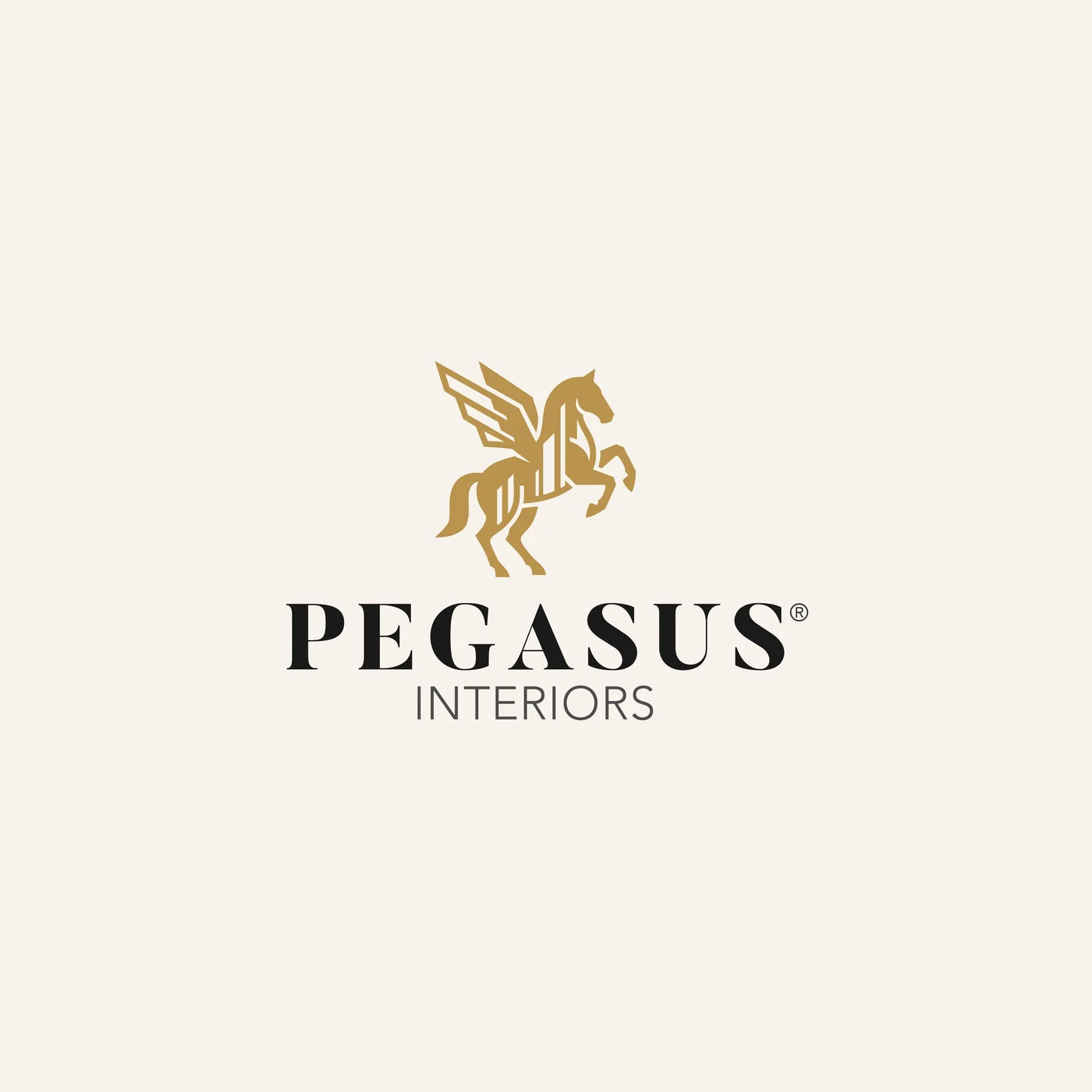
The previous logo
The new logo
Before and after. The Pegasus and the gold stayed; how they are drawn changed. Drag between them in the case study.

A logo is judged at its smallest size, not its biggest.

Keep what they loved

“We all like it” mattered, so we did not start over. The Pegasus was already theirs, and so was the gold. We kept both and changed how they were drawn.

The horse became one solid silhouette that reads at any size and in any single colour. The buildings did not disappear: they moved inside the horse, as the vertical lines that run through its body, so the architecture is carried in the mark itself instead of standing behind it. The name moved to a confident serif, with INTERIORS in a clean sans beneath it. The tagline stays, for the moments when the company introduces itself.

Then we built the rest

A better mark was only the start. A brand is what happens when that mark meets everything else, so we designed the pieces it would meet first:

  • A logo system. Stacked and horizontal lockups, with and without the tagline, each on light and on dark.
  • Two circular emblems. Seals for stamps, packaging and uniforms, and a faint watermark on the letterhead.
  • Four colours. Pegasus Gold, Charcoal, Cream and Stone, taken from the materials of a well-finished room: brass, dark timber, warm plaster, stone.
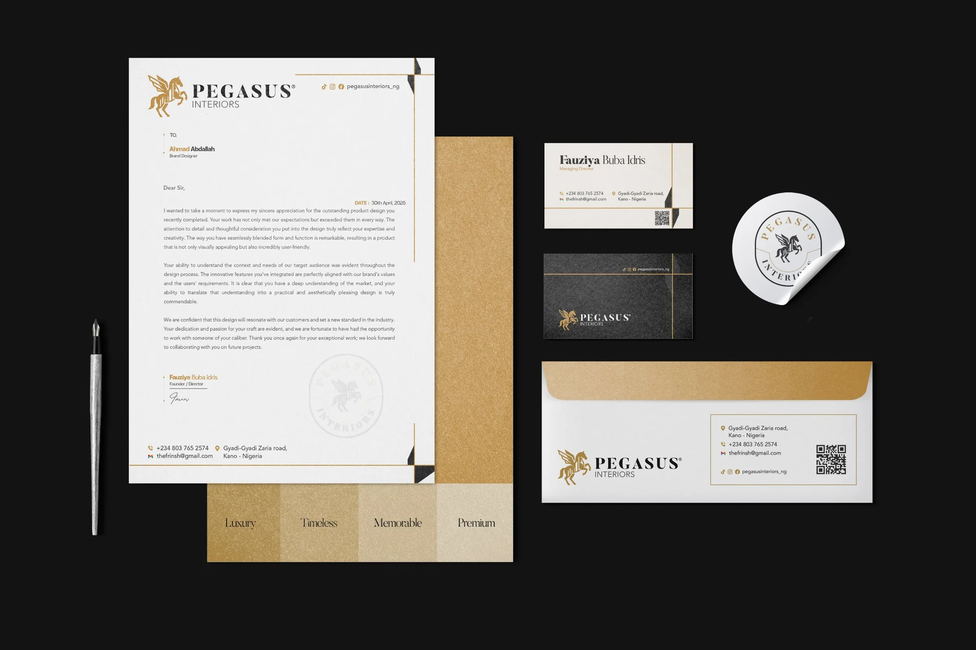
  • Stationery. A business card, letterhead, invoice and envelope, tied together with thin gold rules.
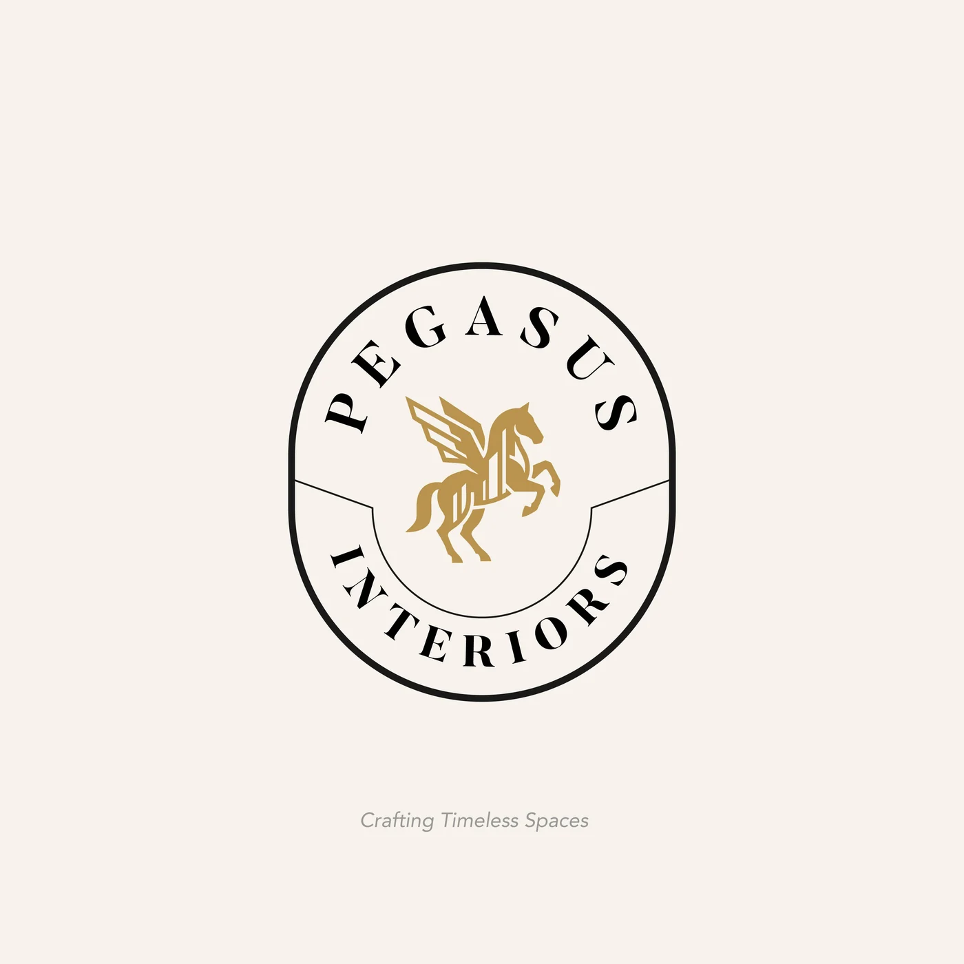
Stacked logo on cream
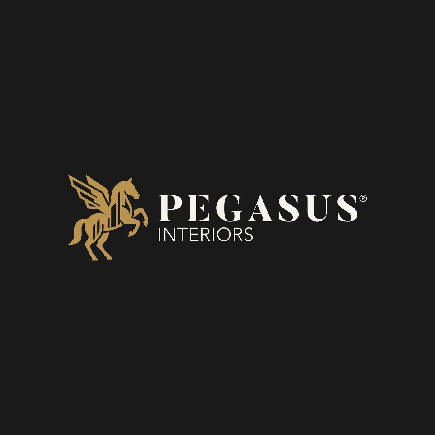
Horizontal logo on charcoal
Emblem on cream
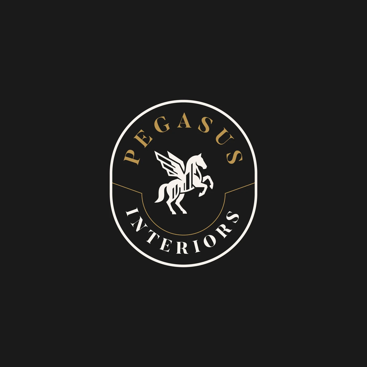
Emblem on charcoal
One mark, many jobs: stacked, horizontal and the emblem, on light and on dark.
The full Pegasus Interiors stationery set: letterhead, business cards, envelope, emblem sticker and gold palette cards
The first pieces of the system: letterhead, cards, envelope and an emblem sticker, on the gold palette.

The moment the brief changed

When the client’s leadership saw the identity, the reply that came back did not ask for changes to the logo. It said the list was good but incomplete, and asked for something much bigger: “We need to have everything in one place.”

What followed was a list of everywhere the business shows up. A favicon. A compliment card and an email signature. Quotation templates and delivery slips. Flyers, and billboards in both orientations. A WhatsApp Business banner, Instagram templates, price tags, packaging stickers, the company vehicle, the staff uniform, a presentation template. Each one, they asked, labelled with its size and its use. And a note that this could be the start of a long relationship.

Read that list again and notice what is not on it: another version of the logo. They had stopped asking for a mark and started asking for a brand: one consistent way of showing up on a van, a price tag, an invoice and a phone screen. That shift is the whole point of this article.

So, why is a logo not a brand?

Because a logo is one decision, and a brand is every decision that follows from it. Pegasus Interiors taught us to put it simply:

  1. A logo identifies you. A brand makes you recognisable everywhere you show up, even when the logo is not there.
  2. A logo is one file. A brand is a system: versions, colours and rules that tell everyone how to use them.
  3. A logo is judged on a screen. A brand is judged on an invoice, a van, a uniform and a WhatsApp chat.
  4. “Something better” rarely means a new logo. It usually means something that works everywhere.

Pegasus Interiors came to us for a better logo. They left with a light identity built to last: a mark that holds at any size, and the essentials to show up the same way on a card, a letter, a door and a shopfront. Whatever comes next can be built from it.

The full project

Compare the before and after, try the logo at any size and explore every version of the Pegasus Interiors identity.

Have a project in mind?

TELL US WHAT
YOU’RE BUILDING.

Launching, changing or starting something. Send a short note and we will come back with questions, a scope and a number.

SEND US A BRIEF