

ONIMS AGRO SOLUTIONS
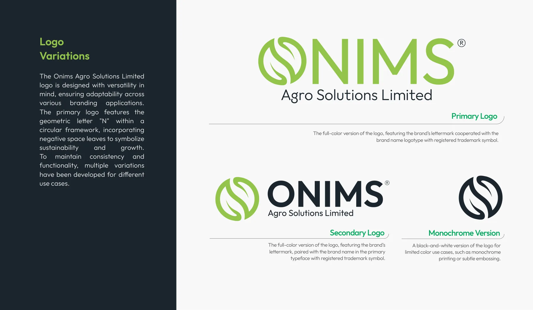
An agricultural company ready for its next stage of growth. We rebuilt Onims around a single letter: an N drawn as a circle, with two leaves hiding in its negative space.
The brief
Onims Agro Solutions Limited works in sustainable agriculture. Its old look no longer matched the company it had become: modern, innovation-led and serious about sustainability.
The approach
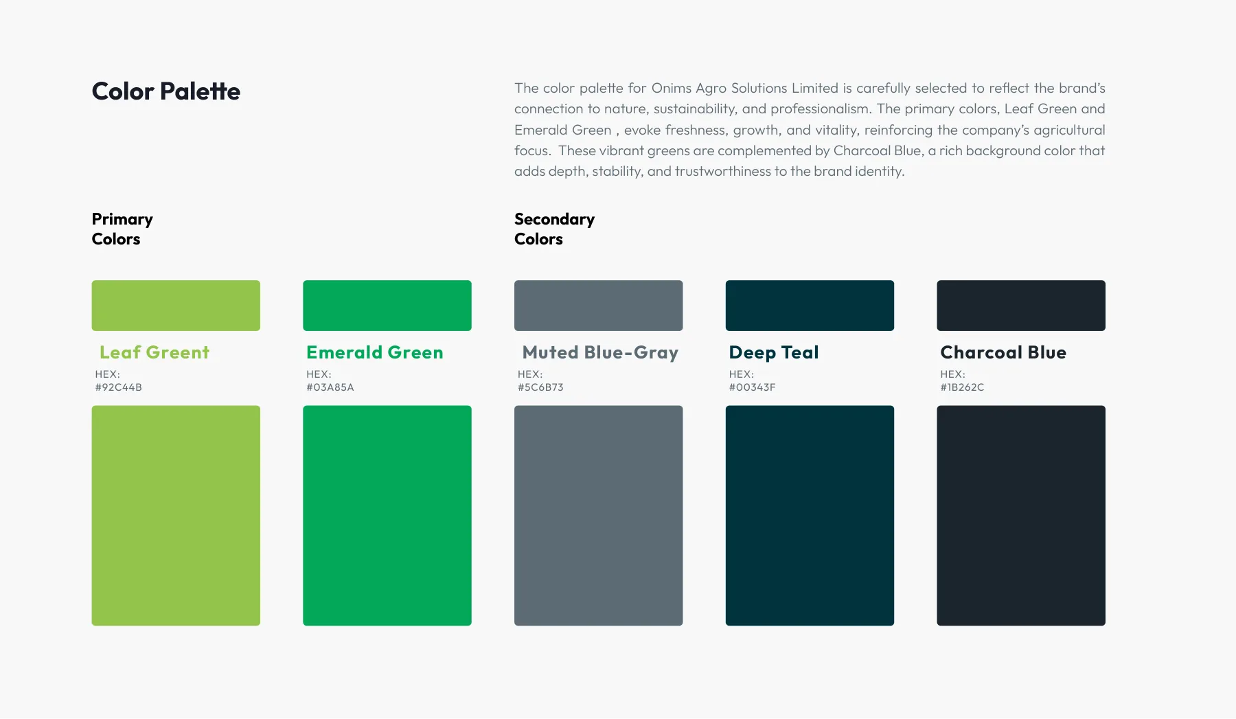
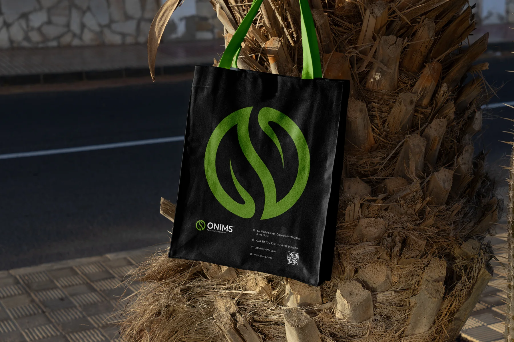
The new mark draws the N from Onims in a geometric circle line. Look again and two leaves appear in the negative space: nature and agriculture inside the initial. The circle stands for unity and the agricultural life cycle. Leaf green and emerald bring growth and freshness; charcoal blue grounds them.
Scope
- 01LogomarkA circular N with two leaves in its negative space.
- 02Logo systemPrimary, secondary and monochrome logos.
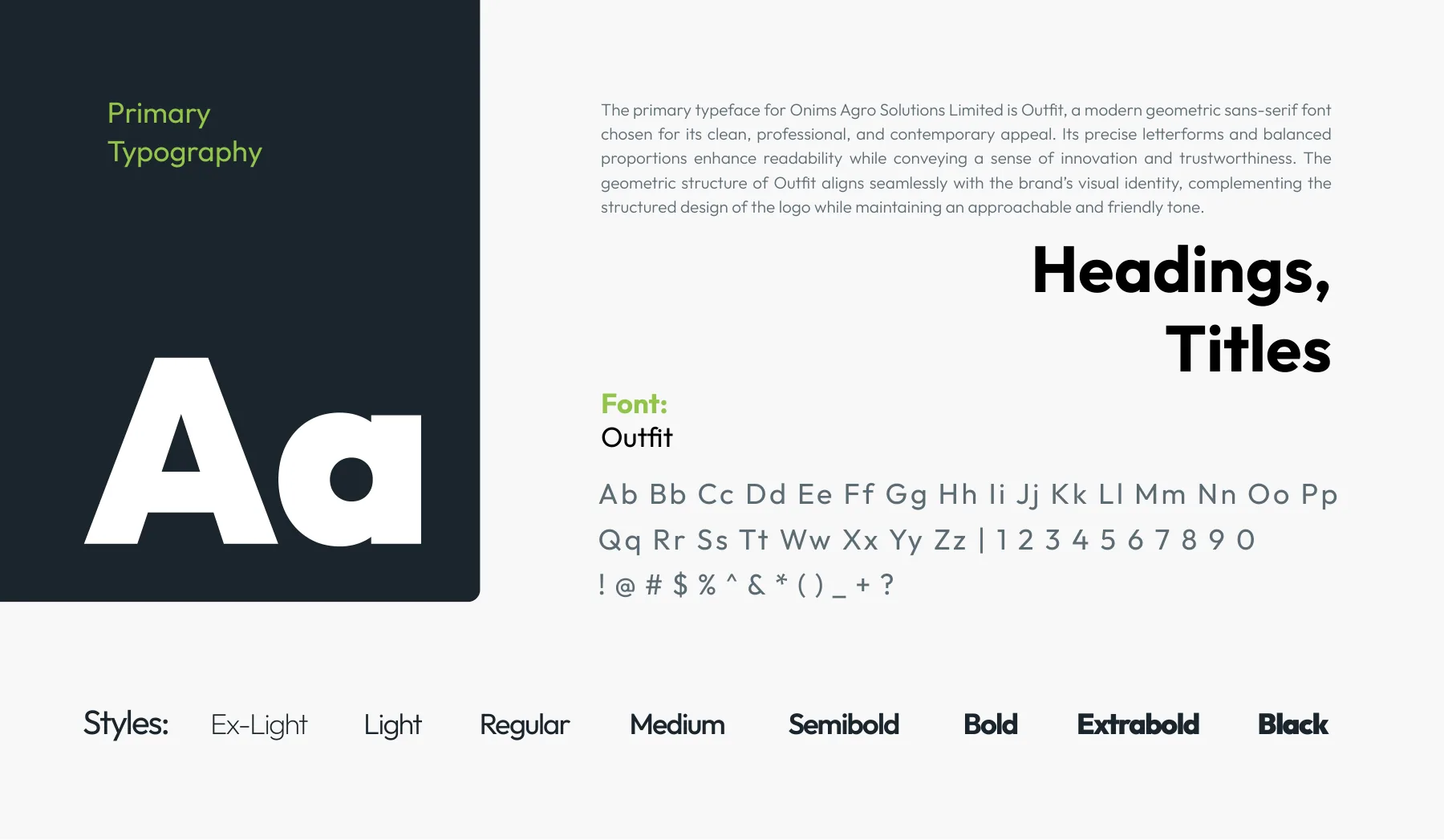
- 03Colour & typeFive colours and the Outfit typeface.
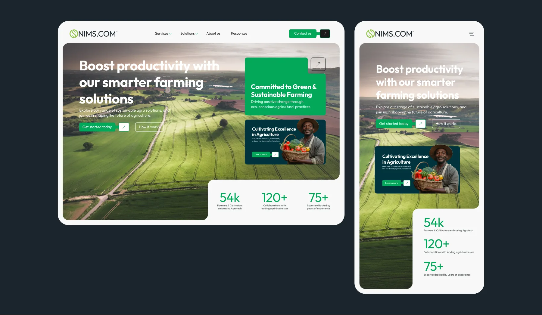
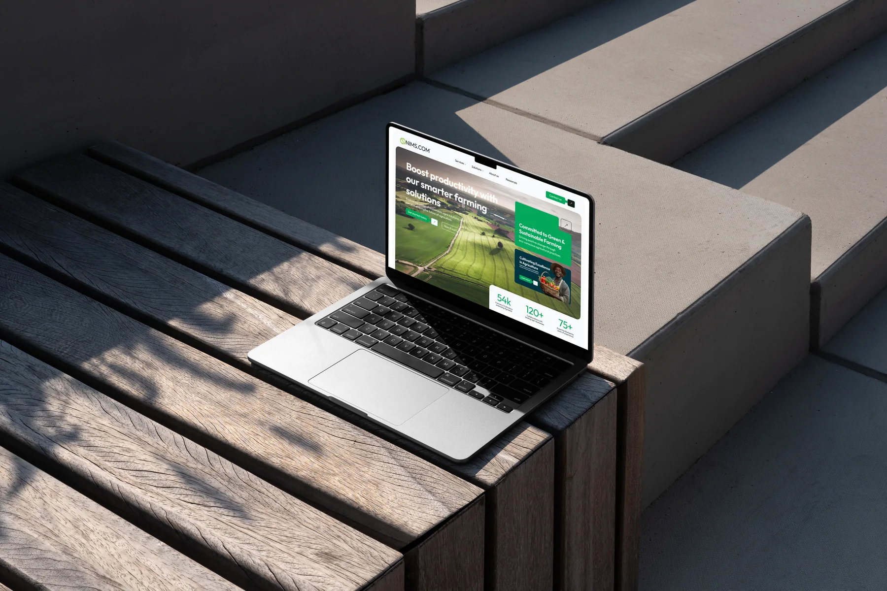
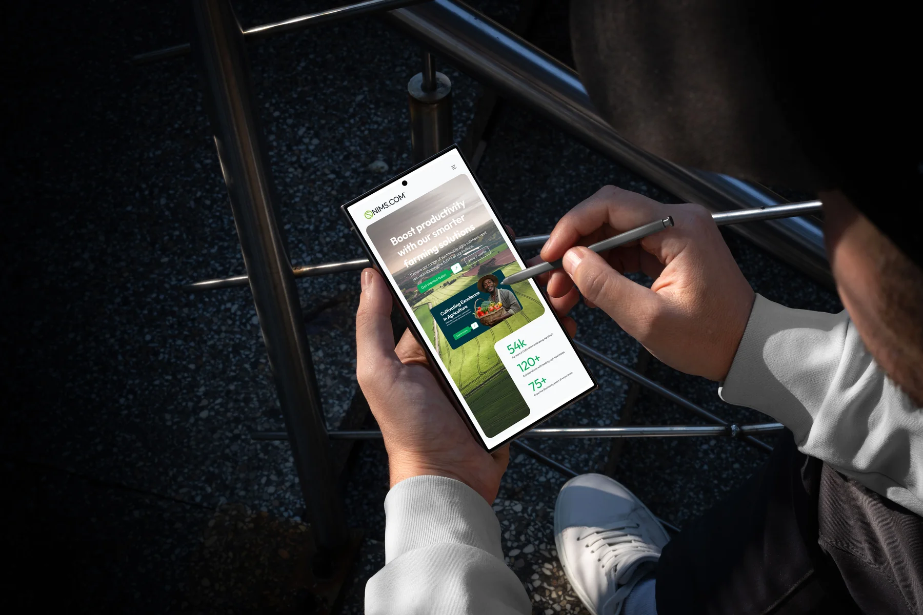
- 04Website conceptA homepage concept for onims.com.ng, on desktop and phone.
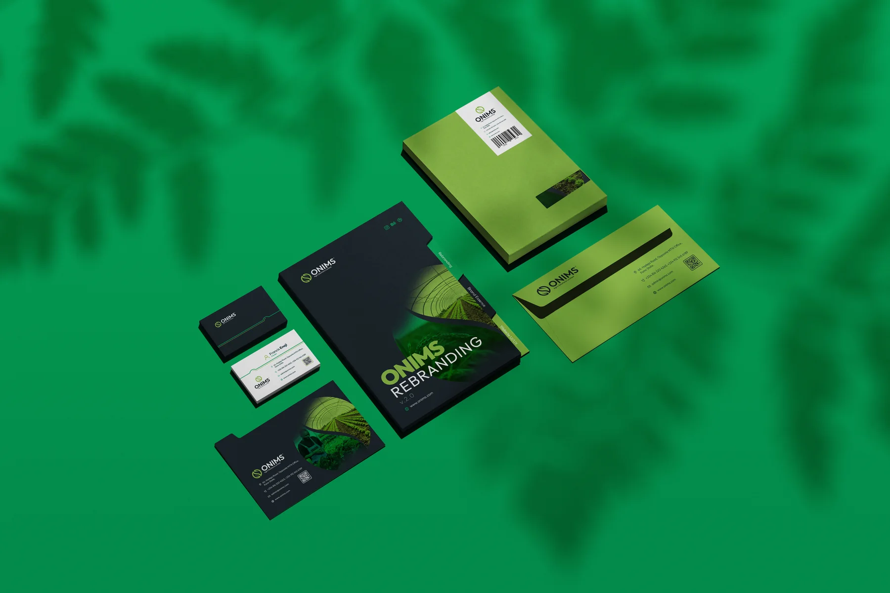
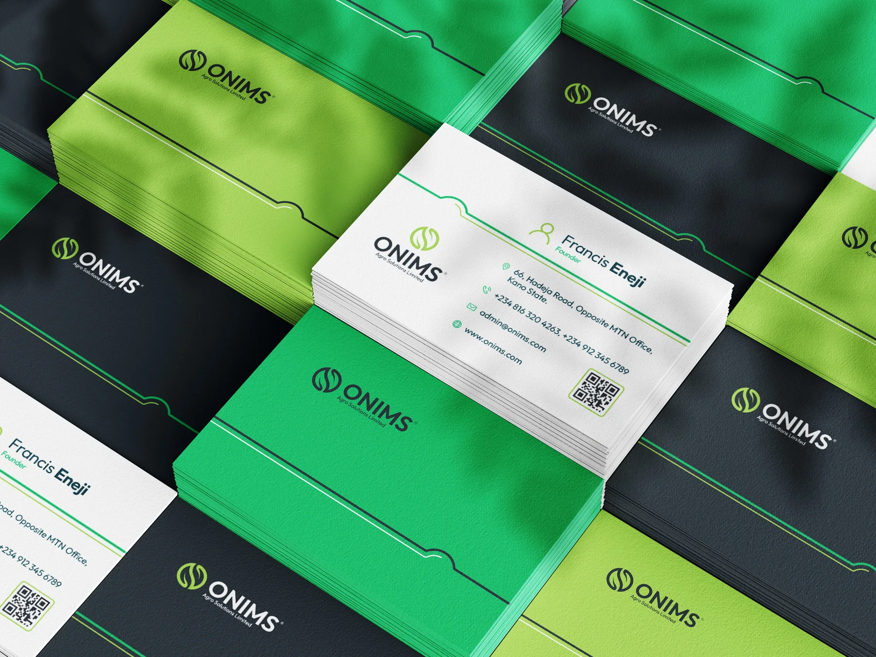
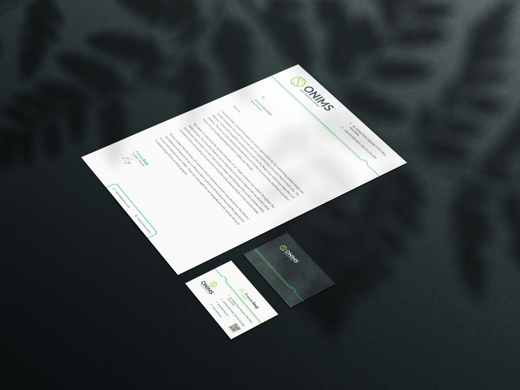
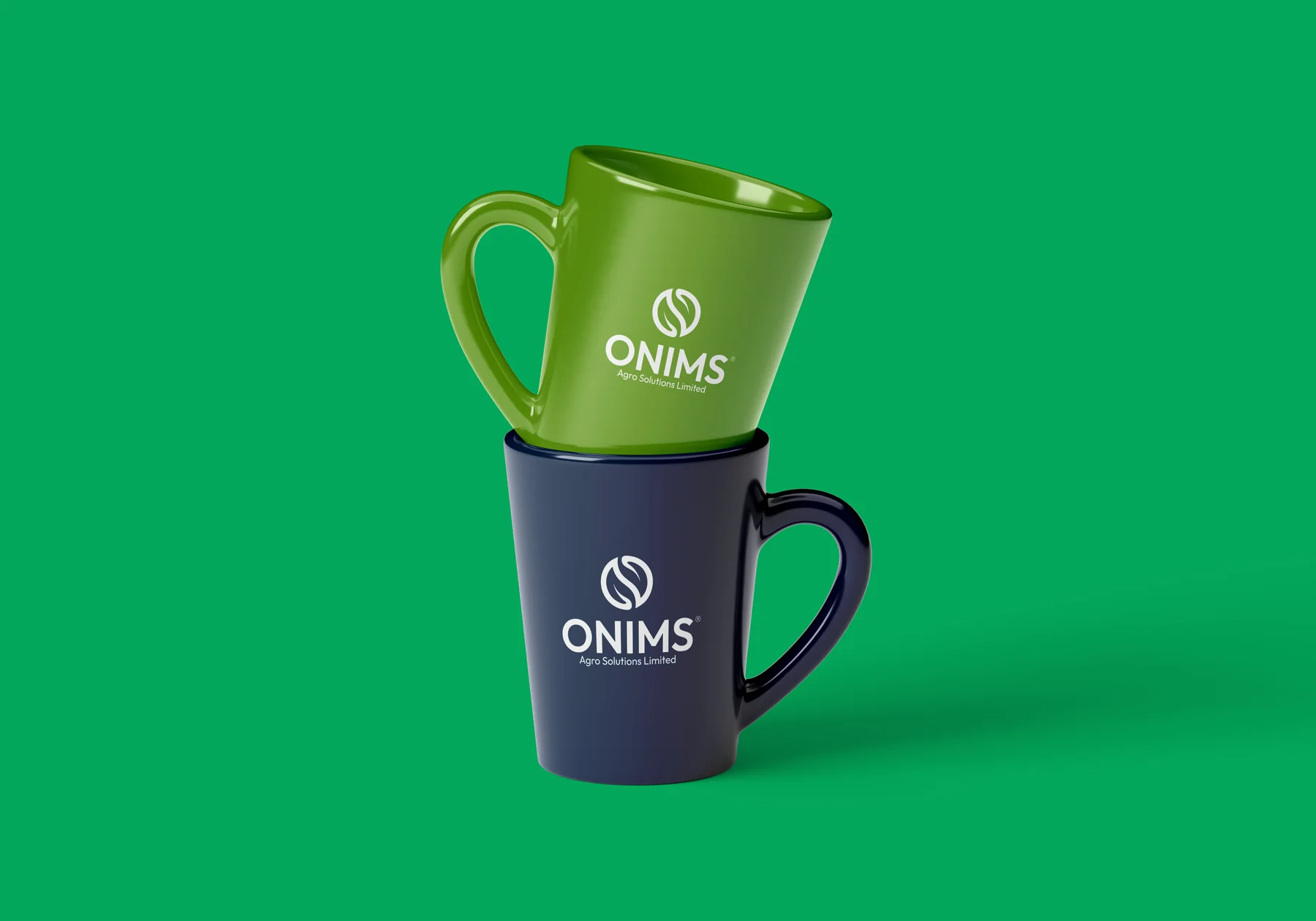
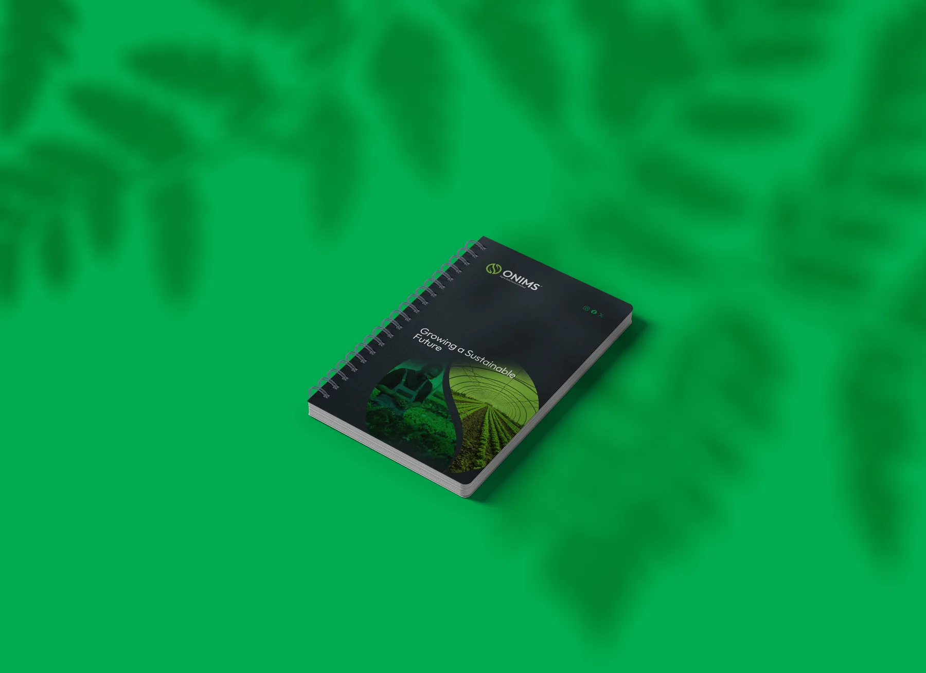
- 05Brand in useStationery, notebook, mugs, tote, uniforms, umbrella and vehicle.
01 Inside the guide
THE THINKING,
PAGE BY PAGE.
Pick a page from the brand guidelines: how the mark is built, what it means, and the rules that keep it consistent.
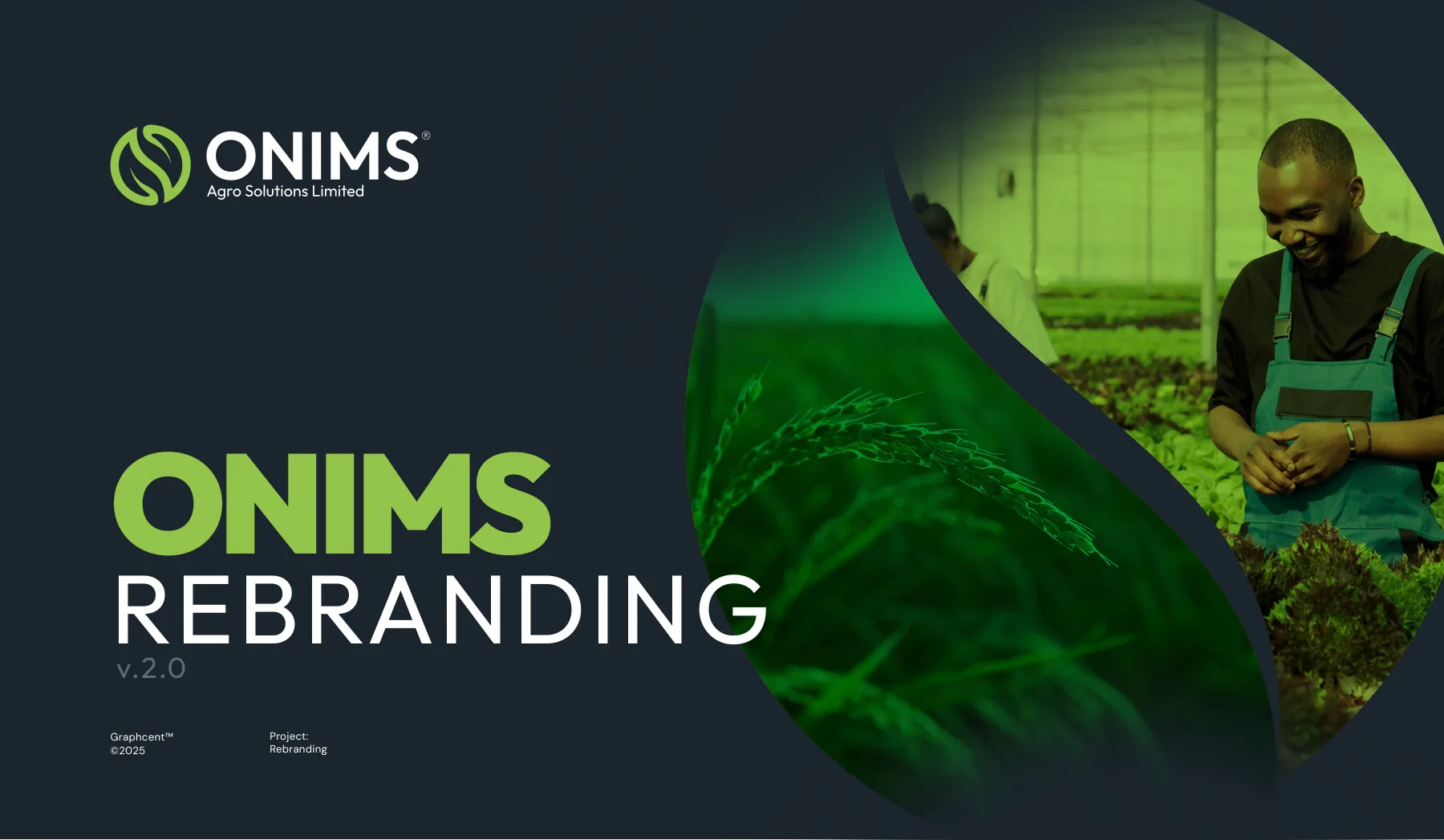
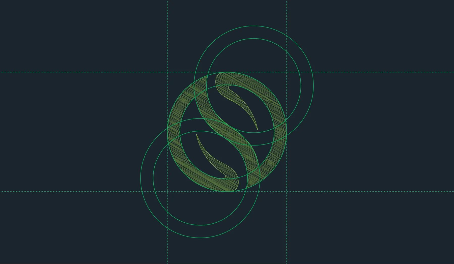
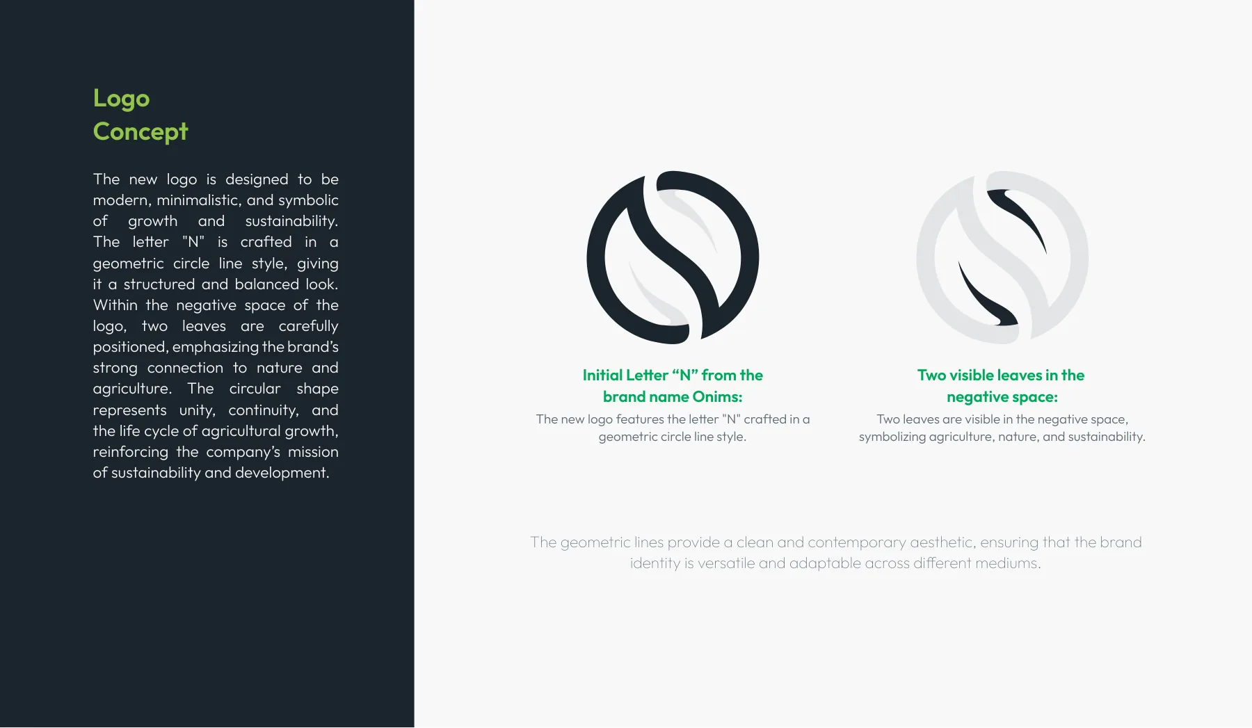
The Onims rebranding guide.
Download
Onims Agro Solutions brand guidelines
For viewing only: contact details removed, not for reuse. © 2025 Onims Agro Solutions Limited. Design by Graphcent.
02 Colour & type
THE PALETTE.
Tap a colour to copy it. Type: Outfit.
Outfit
03 In the world
THE BRAND
IN USE.
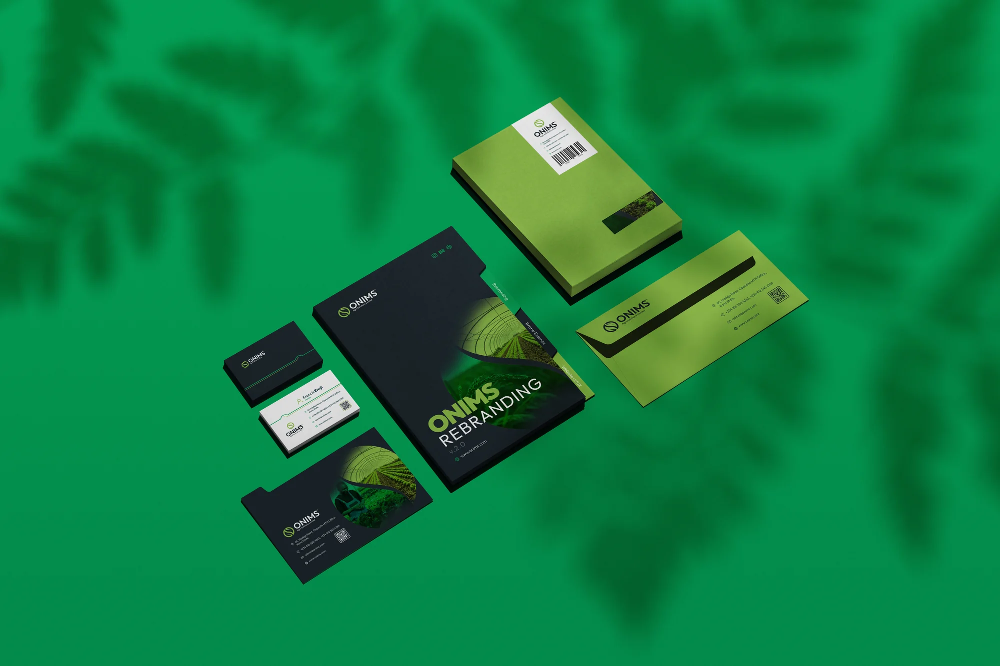
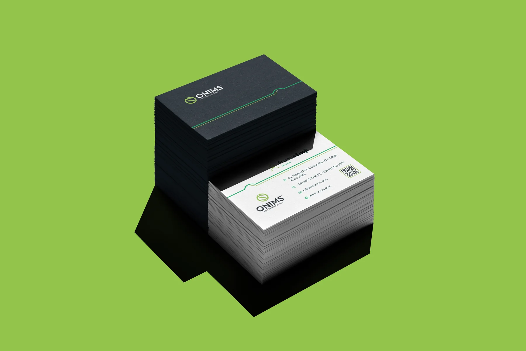
Where people meet it: stationery set, website on desktop, website on phone, business cards and more.
04 Deliverables
WHAT WE
DELIVERED.
Identity
- N-and-leaves logomark
- Primary, secondary and monochrome logos
- Five-colour palette
- Outfit typography
- Brand imagery
Brand in use
- Website concept
- Stationery and business cards
- Notebook, mugs and tote
- Uniforms and caps
- Umbrella
- Vehicle livery
Guide
- 24-page rebranding guide
Have a project in mind?
TELL US WHAT
YOU’RE BUILDING.
Launching, changing or starting something. Send a short note and we will come back with questions, a scope and a number.
SEND US A BRIEF