It started with a WhatsApp message
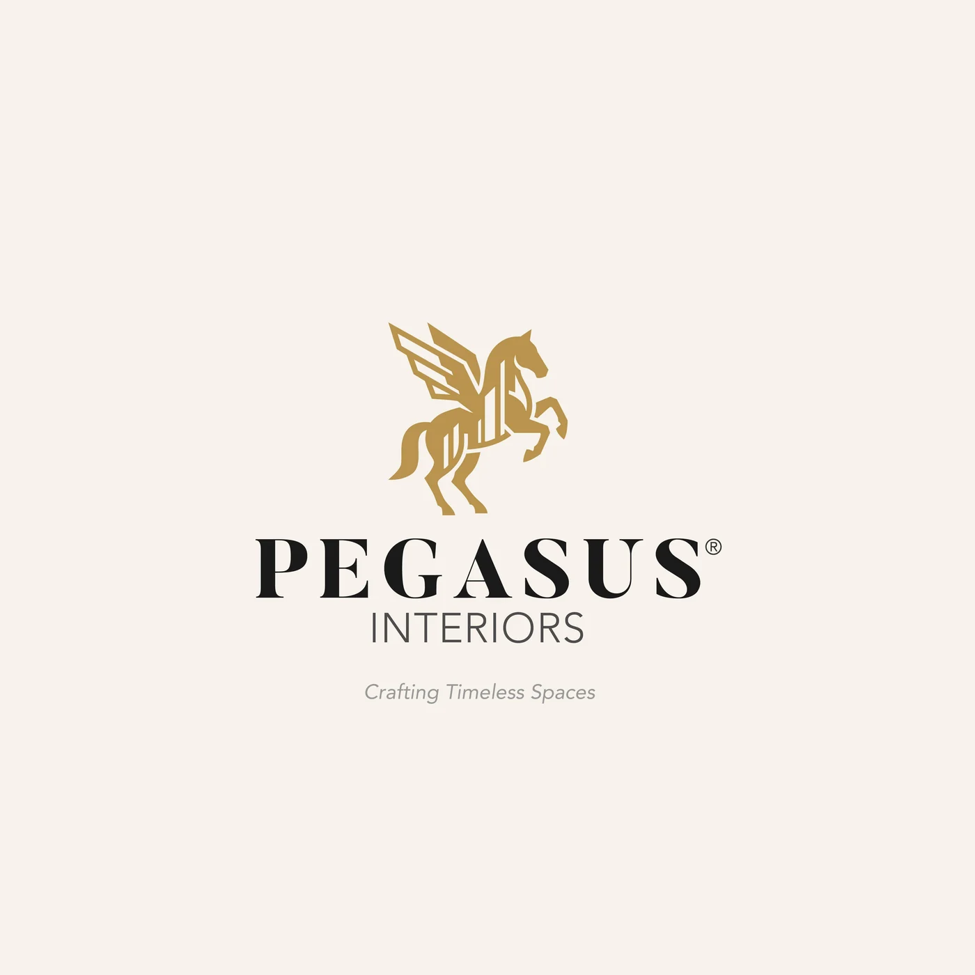
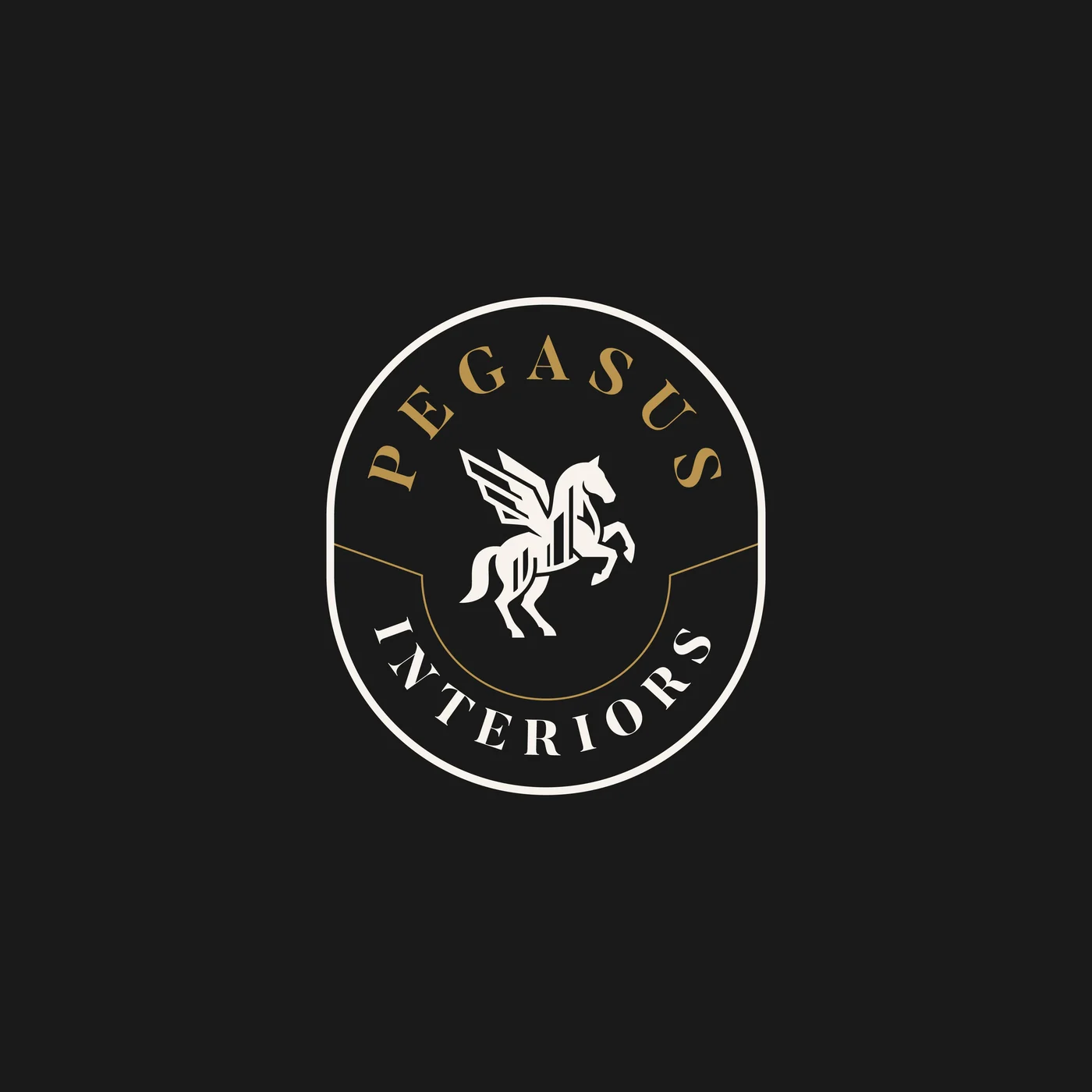
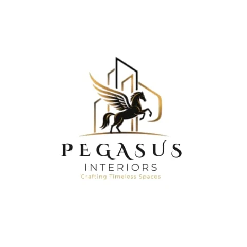
Most of our projects begin somewhere less formal than a brief, and this one began in a chat. Pegasus Interiors, an interior design company in Kano, sent us their logo: a winged horse rearing in front of thin gold building outlines, the name set in a light, spaced-out serif, and the line “Crafting Timeless Spaces” underneath.
Then came the sentence that every designer has heard in some form:
It is a more honest brief than it sounds. Nobody disliked the logo. What they could not put into words was that it was not doing enough for them. That gap, between a mark people like and a mark that works, is the difference between a logo and a brand.
What “better” actually meant
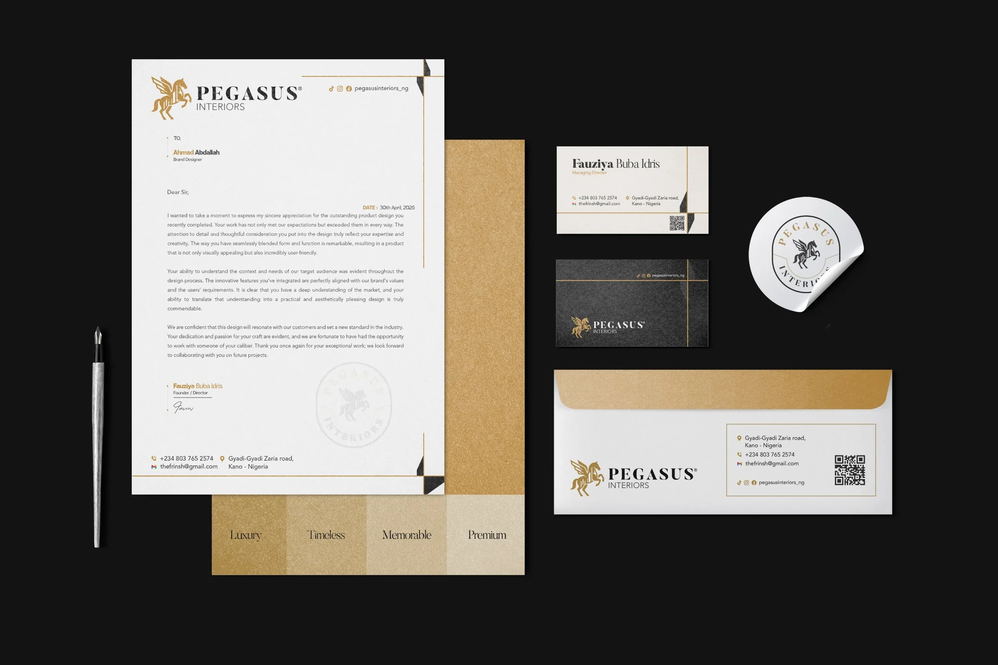
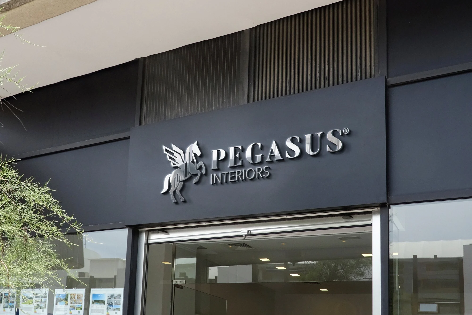
Before drawing anything, we listed every place this logo would have to live. A business card. An invoice sent to a client. The sign above the studio. The side of a van. Embroidery on a staff shirt. An Instagram avatar the size of a fingernail. A browser tab smaller than that.
The old logo was drawn for one of those places: large, on white, in full colour. Its gradient wings and hairline buildings were lovely at that size and lost almost everywhere else. Shrink it and the buildings vanish. Print it in one colour and the wings turn to a blur. Stitch it onto a uniform and the detail has nowhere to go.